Your Proposal Yes Page
I did chuckle when I saw this. One of the 37 signals guys came across this terrific attempt by a toll-booth operator to make their life easier.
They simply typed up 18 questions. They must have been driven bananas by hearing them so many times. It all fits on two sheets of printout, centre-justified, who cares about the typos, and only two require a tad further info. Here’s the top (you can view the whole thing with a click);
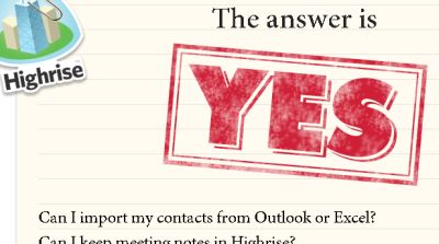
The answer to each is a resounding “YES!!”. And the person that spotted it beautifully adapted the idea for a webpage of a new product of their own. In an evolution of a standard faq-meets-product-points page, here’s how it starts;
And here’s how it finishes;
After 45 “Can I’s…”, what about that 46th question.
Imagine a Proposal that includes a page like this. Some neat tweaks and you could be well on your way to both setting yourself apart and showing how closely you’re tuned in to their needs.
- keep it to a neat single page
- show just a few key questions
- have large lettering
- avoid the temptation to list features
- major rather on key decision criteria and the few mini-points that make a big difference
- remember not to come across all ‘marketing flannel’
You simply must adapt this yourself for your next official Prop doc. Genius.


