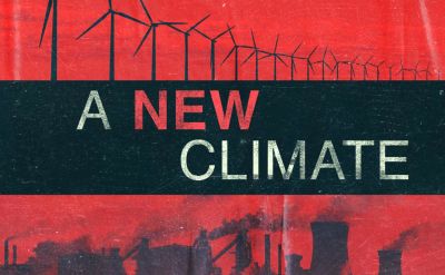
A New Presentation Climate
Another week, another climate change journalist thread. London based Sky News broadcast their latest series of eco-reports, called A New Climate.
The header image above struck me for being the type of three-way horizontal bar split readily adaptable for a routine sales presentation. Smart-fonted title, point or headline in the middle, then a pair of contrasting landscape images above and below. All neatly given a neat matching colour scheme.
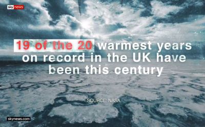
They trail their works with the ad-break bumper image above. Quite a jolting stat. The end of June 2019 saw record temperatures across Europe. Athens, 10 July 1977 recorded 48°C. Forty years we fry near that anomaly with annual regularity.
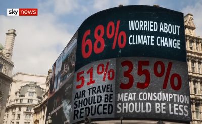
The twelve minute launch report features a pair of landmark snaps with varying figures imprinted upon them. A trio of public attitude survey percentages on Piccadilly Circus jumbo ad screens. Then three forecasted sea level rise impacts, one after another, at threatened Fairbourne, North Wales where 800 people have been told they must move from the retreating shoreline.
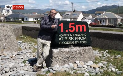
When a picture allows – although it’s never as easy as you think to find a “flat” enough image – this is a lovely technique.
Finally, a bonus from how their ongoing reports present slides.
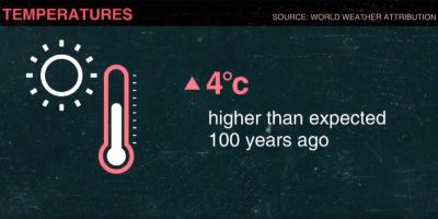
Shown in the week that France recorded 45.9C, its highest ever temperature – up by an astonishing 1.5C – we learn that the trend is indeed alarming. Each slide displayed simple weather related iconography with a short message alongside.
Note too excellent graphics previously ran by the same media house from 2014. Definitely a decent idea or two to keep in mind.

