A Rare Example Of A Delicious Donut Pie
In English broadsheet The Guardian’s irreverent daily poll spot, here’s a tasty donut.
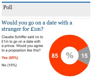
As I blog often on the (way better) alternatives to pie charts, it’s only fair to add balance and show where one can actually (whisper it) work well.
Donuts are usually a disaster on a slide.
But this treatment shows the precise circumstance where they are ideal.
It answers a question with only two outcomes. And those responses are stark in that one is huge, the other tiny. This donut highlights that discrepancy clearly.
Then there’s the way the small slice is turned to quarter past the hour. It is almost always left lazily in the position up top. I also rather like the Pac-man-ish way the large number is chasing the small.
The middle of a donut is usually left alone. Whatever the background colour is shines through. Here, the white circle holds a symbol (% in this case). And it looks good. You could put anything in here aside from the obvious percent or currency notations. So long as your icon remains crisp.
If you were mulling over other options, then you’d recall that polls are typically visualised with horizontal bar charts. Hardly eye-catching. If you were thinking of the infographic option, maybe in this case isotypes of dollar bill signs in the two colours in a square stack might work?
Finally, consider the overall clarity of the representation. Yes, there’s lots of writing here and an uninspiring title bar, but if this was a slide glowing from your office wall during a pitch, would it stil pack the same punch? Probably…! So not a bad template to build on at all.