Abysmal Performance Shown in Graphs on Health System Anniversary
Mainstream British media seemed more concerned with the chilling corral of children to sing 'happy birthday' to an institution with dystopian cult-ification rather than exposing why it's in need of its own urgent wellbeing intervention.
As the UK taxpayer-funded, supposedly government-run health service reaches 75 years since inception, thankfully there were those sensible enough to provide graphical insight. Their main thrust being to show things cannot go on as they are with a system so blatantly unfit for purpose and that you never solve problems by just chucking money at them.
What's also useful about such contributions are the tips for our next slide charts.
First, the lesser-spotted waterfall.
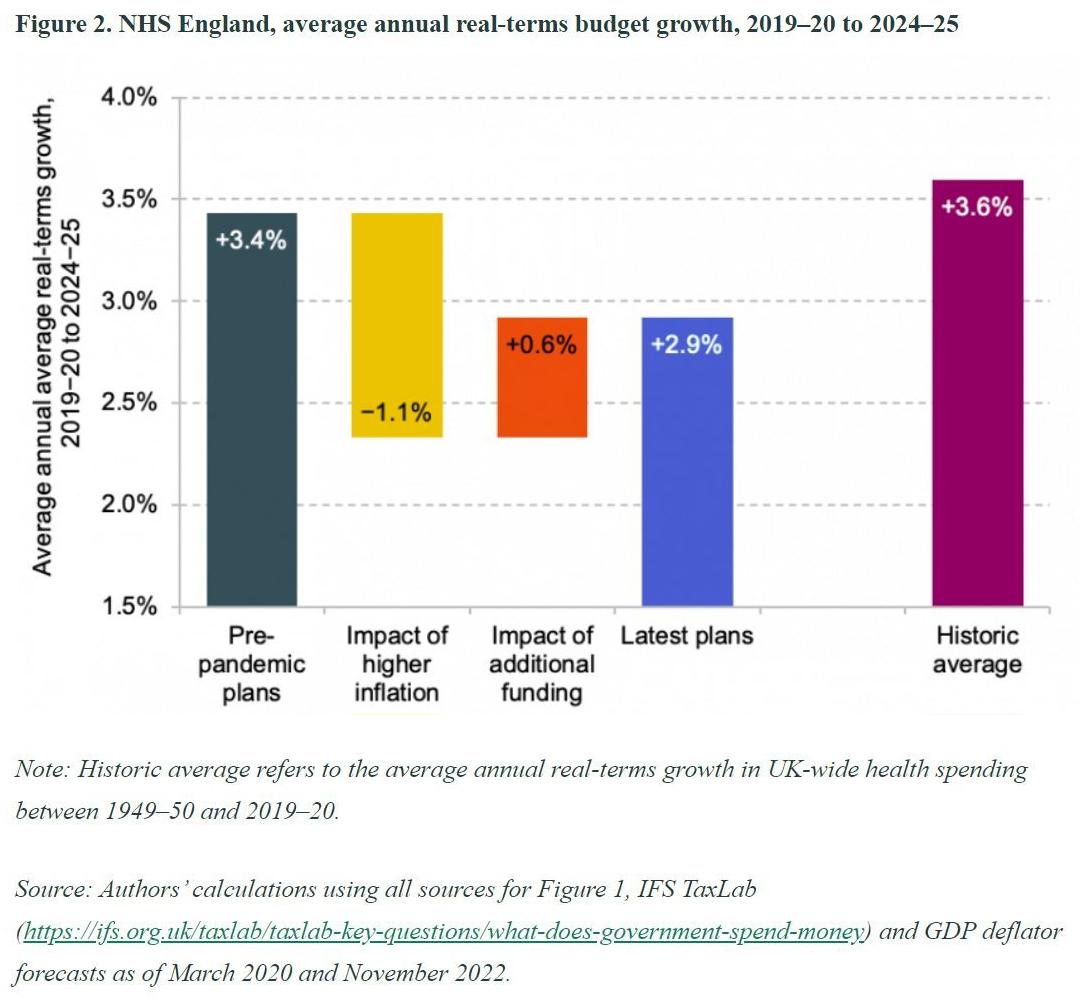
Here a London think tank give their spin on overall funding levels. As questionable as their percentage calculations may or may not be to those with insider knowledge, you can still see their attempt to paint a potential subsequent shortfall in expectations 2½ years on from initially set out.
The colours don't really help though. Even less, the 'historic average' bar on the right. I wonder if they considered a purple dotted y-axis line instead?
Next, a pair from a dedicated health policy and performance think tank.
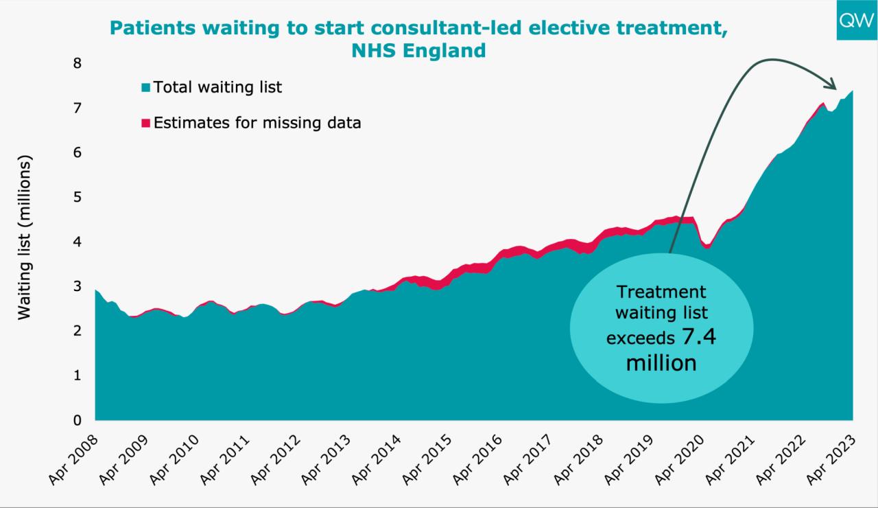
Look where a blatant disregard for serving your customers gets you. Backlogs double.
Note the use of spotlight oval and arrow line.
Next, I'm reminded of the old saying in Hospitality; you can tell how a place is run by the state of their loos. In similar fashion, when selling to Manufacturing or Distribution companies back in the day, we always wanted to peek inside their Stores. The state they were in would reveal huge insight into their way of doing business.
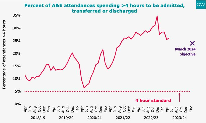
If you judged how The UK is run by the state of its walk-in 'accident & emergency' centres, would you wish to catch the first flight out?
Move on, if you can, from the arbitrary 4-hr wait time 'standard', and see the simple 'x' marks the spot for a randomly assigned new target for sometime in the whenever.
Now we come to someone with you suspect superior graphical resources.
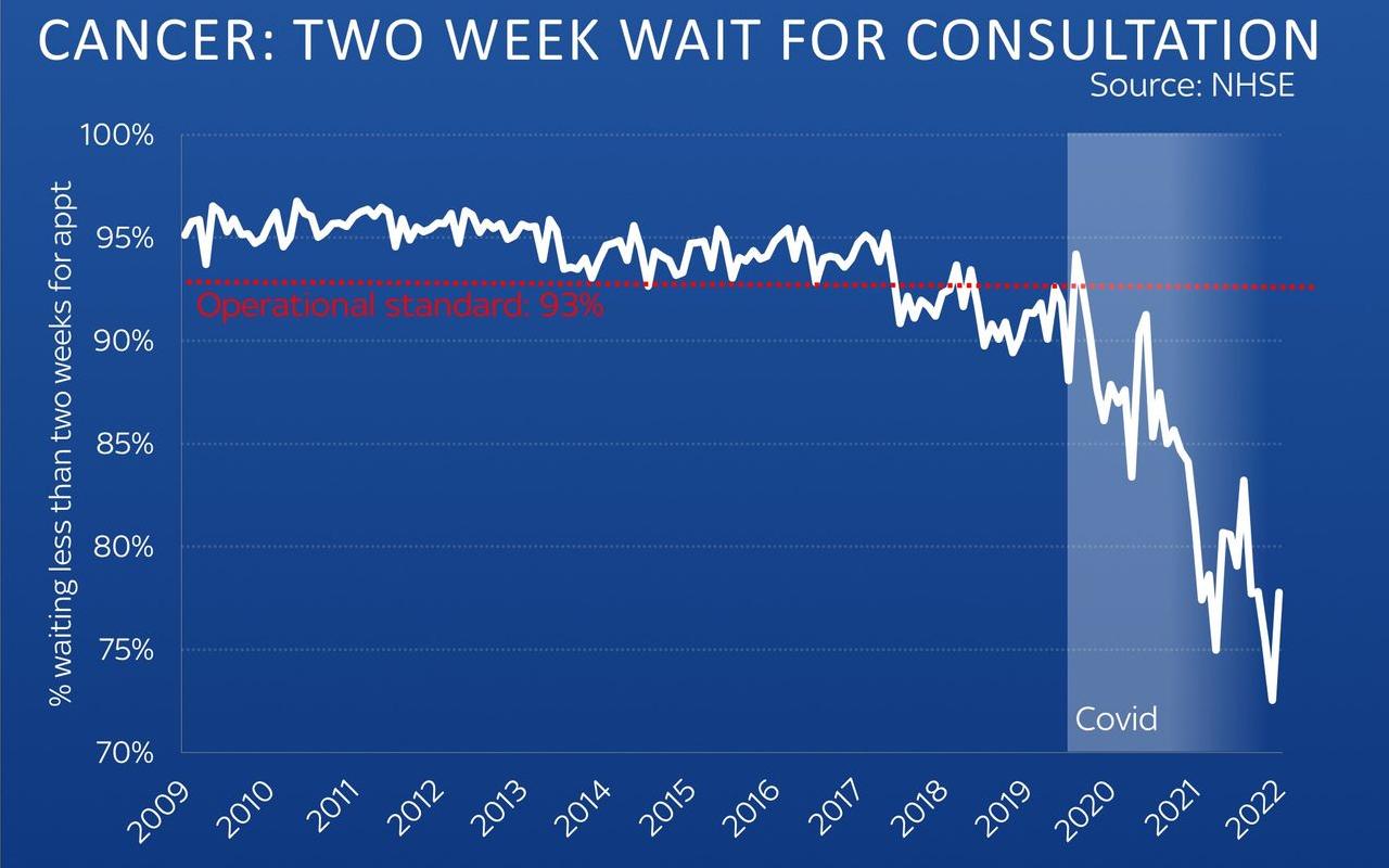
24-hr broadcaster Skynews has a neat treatment for the black swan impact zone. Strange they chose an almost illegible red for their standard markings.
With such performance drops despite the recorded staff influx.
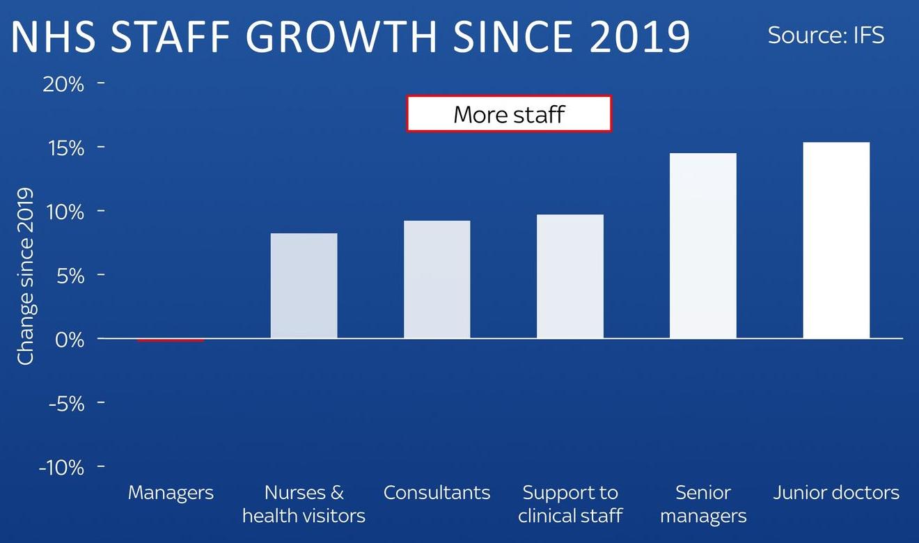
Could that 'more staff' highlight be any better?
But hold on, they go beyond the people.
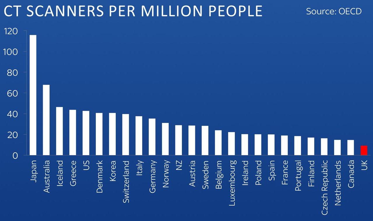
A barchart to highlight the rock bottom-most wooden of spoons.
Let's wrap up with a competitor. Maybe GB News aren't so bothered about charts.
You'd've thought the free-spending UK might have, say a white bar?
I do hope those bar heights are to scale.
At least you can't miss the labelling. Even if it resembles a 16-year olds' school project.
But wait. Repeat the data legend every time. And have all bars in different colours.
Although not charting best-practice, I sense that's part of their point.
The accompanying message verbalised was crystal clear.
Brits ain't getting Value For Money.
Now we can ensure our graphs certainly are.