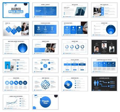
Another Ultimate Pitch Deck Template
Spoiler Alert: It Isn’t.
The web is awash with such decks to download.
All manner of downloadable imagery. Theoretically enabling the standard user access to the graphic design pro.
There are many criticisms of slides so peddled.
To use someone else’s framework that doesn’t neatly match your needs can dilute your impact.
Although ‘editable’, the time taken to amend can outweigh the creation of something similar enough from scratch.
The unique thrust of your message can be lost in a sea of sameness.
Yet this coin does have two sides.
As you might end up with a design that really can set you apart.
This particular deck though, errs down the misguided line.
Let’s first look at these 22 slides in ‘sorter’ view;
‘Blink’ impression? Looks closer to the kind of Duarte-labelled ‘slidedoc’, rather than full-on slide deck. Way too much text for a presentation. Nor enough diagram variety. Use of images is pretty much modern-day clipart.
Perhaps the loudest alarm though is in the structure they recommend.
As the ‘contents’ slide lists (and this is a slide that is a shocker in itself) there are eighteen – yes, 18 – sections. Yikes;
introduction – who we are – why us – about us – mission & vision – our advantages – market opportunity – market size – product & demo – business model – pricing plan – possible market share – competitor analysis process – competitive advantages – SWOT analysis – marketing mix – customer analysis – mores
Simply put, it’d be a miracle if this structure saw your pitch win.
I’ve worked with salesteams that can call on their own presentation admin resource. Some even with a department of in-house design wizards. Also those who have commissioned external agencies for a key ‘Board’ deck (and beyond) creation.
In none of these (relatively commonplace b2b) instances would the above pass muster.
So why should it have to make do for the lone warrior?


