Automatically Tempting
This random ad flashed before me. Occupying only a small fraction of the laptop screen, it still caught my eye. And not only because I was one of their very first bloggers on the WordPress platform developed by these pre-2.0 digital natives.
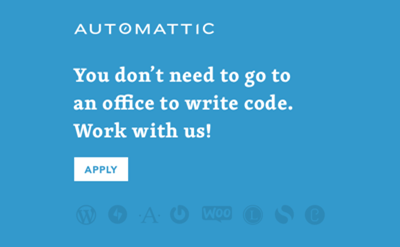
Their original was square – I’ve golden ratio’d it here to be more landscape-slide aware – and stood out for me due to its design ethos.
I see many a sales presenter struggle with over-elaborate slides. I liked the idea of this hiring ad as a selling slide template.
Let’s take six elements.
Firstly, a visual trio;
Single colour background, in their company blue. No pics, no gradient-ing, no multiple splashes.
All the writing is in white. Apart from the action point. Neatly reversed into a blue-in-white box.
Then the logos. The overall company name only (AUTOMATTIC with its forward-slash-inside-circle icon contained rather than separated) relatively understated up-top. The badges of their brands all lined up across the foot, subtly darkened.
Second, the text itself;
Their key recruitment usp appears widely reported. Anyone can work remotely. As of this moment, that’s 930 staff who don’t need an office. They stick this centrally to their main pitch point.
The object, “code”. Nothing fancy. No mystical mantra. No ‘save/change/better the world’ raison d’être.
A call to arms I quite admire; “Work with us!” Perhaps suitable beyond the job-hunting realm. Accompanied with action box below of small-caps APPLY fitting in well too.
Inspiration for sales slides, Proposal imagery and whiteboard sketching can come from all sorts of places (see my insta for plenty).
I sense here’s a template readily and fairly simply adaptable for many a pitch deck of our own.