Best #Budget2021 Reporter Chart
The UK’s big annual political financial set-piece took place Wednesday. The Budget was unusually given a fair reporting by elements of the perennially, overwhelmingly hostile tv media.
The main thrust being as articulated by one parliamentary Leftist grandee;
To be successful in politics, you have to ride two political horses simultaneously. Rishi has done a budget for the hour and made the possibility of long-term prosperity to fight the next election. Best budget in my 42 years in politics. #Budget2021
— Frank Field (@frankfieldteam) March 3, 2021
One such antagonistic deep-Left reporter with no normal sense of balance hailed this graph as the best question poser from the post-match press conference segment shown up top.
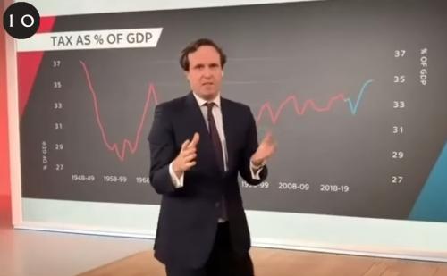
“… use of the tax burden chart in his question … was a stroke of total geek genius. I am in awe.”
The blue line looks like projections from now. A classic J-curve from the relatively recently stable red line pretty soon rocketing upwards.
In the context of the typical barcharts comparing previous estimates with new ones and future projection, this was a definite change-up in presentation.
A reminder to not shy away from thinking of a different dataset or perspective that neither your prospect nor any other competitor may have thought of showing.
Then you can also both steal the headline and shape your way the aftermath of an event.