Chicago Exchange Floor Flipchart Interest Rate Arrow
How delighted I was to see a tv presenter use a flipchart.
As someone who often helps salespeople master the deceptively complex performance this entails I watched with great interest.
During one late morning, CNBC cut to a chap on the Chicago stock exchange floor called Rick Santelli.
He’s certainly excitable. When interviewing, there’s a dazzling deficit of depth. As is too frequently the case with these types of broadcast (and not just American ones either). It seems more about how may words the interviewer can machinegunfire into the “conversation”, without pausing almost at all for reflection on the answer. The lack of any ‘breath’ is so frustrating.
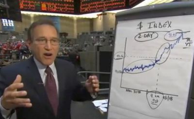
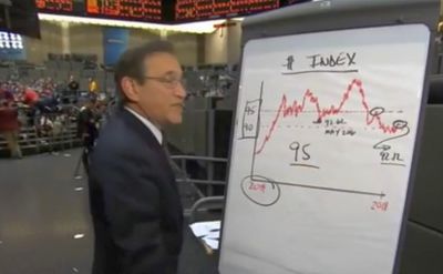
So at the end of his slot on this particular trading day, he sought to illuminate the health of the economy by discussing the Dollar Index; “the dollar’s rally is long overdue”. He was ready with pre-drawn graphs on two sheets. Then set about busily annotating them. Circling parts as he mentioned them. Adding boxes and underlines and arrows and numbers.
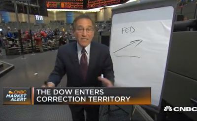
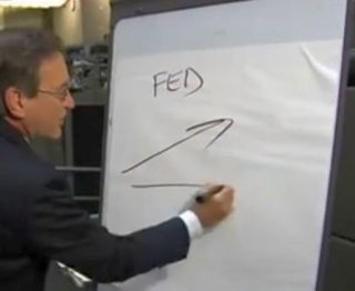
Then he turned his attention to the imminent FOMC meeting. Where American interest rate decisions are made by central bank, “The Fed”. He rips that last page off to reveal a fresh sheet for this 30sec talk;
Now, let’s clear the whiteboard a second for a couple of issues.
On interest rates, [draws arrow upwards, on roughly 45° or 1:1 incline]
they always seem to get an upward drift all along the curve as you go into to Fed meetings, [writes the word FED]
and of course employment reports [draws horizontal line beneath previous arrow].
This is no exception.
Why should you care?
Because in this instance in particular there may be a real buying opportunity for lower rates if obviously we don’t get any change in policy tomorrow, more importantly if we don’t get a rather exciting employment number.
The idea behind this is great.
Leaving behind a simple graphic that gets a killer point across in a unique and hopefully impressive way.
Just three items here. An arrow, word above, line below.
Yet in this particular case, how well does this final image truly get the speaker’s message across though?
Regardless of how ingrained it becomes in the viewers mind, this remains a terrific technique. One I hope you at least drop into the end of your sales meetings.
What we must ensure we do then, is to create a useful, quick yet elegant, piece of whiteboard craft that does actually pack our punch. Leaves it seared juicily in the prospect’s business brain. Allows it to percolate profitably throughout all those entering the room next and beyond.