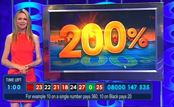
Gambling TV's Attention Grabbing Big Number Slates

I saw recently that after midnight, the second-most watched tv channel in England turns over to gambling.
Now celebrating a nationally humiliating ten year anniversary.
I watched as many minutes as I could before onsetting depression threatened to prevent sweet dreams.
What I did notice, was their approach to what the presenter referred to as the “slate”.
Or to selling you and sales me, the slide.
Each was highly coloured in the style of old school Hong Kong neon streets. Had animated letters and digits. And gave a very simple message.
As you’ll see from an elder example above. A glistening 200%.
Three slates I caught hailed the decade-long existence, and showed the millions won (* but not collected, they small print state) both this month and ytd.
Each time the number zooms around writ large before settling into the message.
Thankfully animated slides are almost a complete swish in the past nowadays.
Building a slide as the audience listen becoming more the norm.
What is interesting though, is how this outfit, creaming untold gold from the top of an incredible nocturnal pile, focus on simple, large numbers. Understated they are not.
If you’ve a big number, then maybe you too could show it proud.
After all, if you’re talking about, say a two-hundred-percent-something, and want the impact to last a while, why not leave a single slide up with the figure booming outwards.
You needn’t boast the skills of a telly technician either. The easiest treatments probably being this pair. A darkish background photo can have huge white basic font sums (with a thin outline if necessary) plastered on top. Likewise go the other way, and have a single full background colour with your number atop to contrast.
Making your point stick in a way that your prospect surely cannot slate.
footnote, I did wonder from where the synonym slate came. Perhaps it’s a co-opted film term, clapperboards and all. Or maybe it builds on what every slide starts as, namely a blank slate. Or what about in ye olde days when possibly a single slab of slate could have you take chalk to your pitch(!) In whatever case, Microsoft themselves strangely provide their own ‘slate template’, “a general purpose design in 16:9 format, suitable for any situation: business, education, or home use” from where you’ll find several others too;

