Gaming Slide Colour Switch

A presentation slide tip that I’ve given salespeople came to mind recently.
When I saw a tweet from top Japanese video game designer of my youth, Konami.
Sadly a game maker who’d created an infamous ‘cheat’, known as the ‘konami code’, died.
In tribute the company published the method by way of neat tile above.
What struck me from a sales slide perspective, was they were not precious about their corporate design.
I was pretty sure their current logo was that red colour yes, but as font. On a white background. (Although they have had a reverse previous). So here they’d flipped it for this. Deliberately.
I myself have had the battling conversation of trying to persuade someone that they must switch around their colour on white backdrop for max impact text slides. (Although not an absolute rule, many a sage says never use white; only dark backgrounds will do.)
Many a brand marque for business of long-standing has a single coloured word. Sitting on white, blank behind.
Which is ripe for swapping.
Look how much better the characters up top look than they would have as red-on-white.
Can the same be true of your favoured phrase for projecting up large?
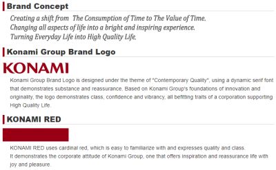
As a footnote, I found this explanation on their corporate site. Cardinal Red. With its attitude offering the seemingly mis-translated “inspiration and reassurance life with joy and pleasure”. What does your colour demonstrate..?