Going Down A Storm With Your Printout Charts
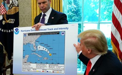
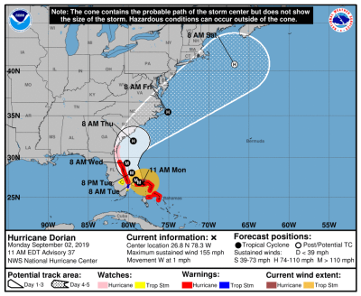
America’s National Hurricane watchers clearly have a big printer. Above is their widely shared printout of an early forecast for 2019’s Hurricane Dorian. Deemed such a threat, that in this Oval Office press event, the US President warned that the incoming storm was “a monster”.
Not every office has large format printing on tap. Yet many still house an old-school machine that can churn out a decent-sized A3 (aka Tabloid or Ledger) sheet.
I regularly encourage salespeople to output just such a physical rendering of their key chart. Even hunting out the nearest art supplies store for a piece of lightweight mounting board to stick it on. Then take along to your next important prospect meeting.
There is power in having a prop that can be physically held by your potential clients. It also gives maximum punch by careful choice of when you reveal it. And be left in view throughout thereafter.
These projected path images are known as ‘cone maps’. Whilst good to see used in this way for the public safety announcement, there’s been a storm of a different kind after.
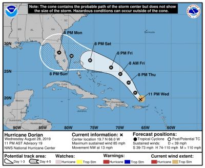
Hold on a minute. The original, as published on the official NOAA website, is different;
Spot the element of dissimilarity with the pic at the very top? Let’s zoom in;
It seems that somehow, someone has taken a marker pen to the ‘cone’. An extra bulge appears. Newly covering the southeastern corner of Alabama.
Media and internet memesters duly revelled in this.
There is a simple Sales point. When you use this tactic, be very wary of scrawling all over your collateral. If you must, perhaps it’s apposite to have a second in reserve, to remain unblemished for comparison or back-up as substitute.
A second issue occurs to me. That of forecasting accuracy in general.
Despite the billions spent on modern-day weather computing, we cannot correctly guess tomorrow’s conditions. Whilst warning people of such a storm is surely a good thing, this forecast proved erroneous.
Dorian, at time of my blogging, hammered through the Bahamas, then took a sharp turn north. Skirting, but not actually breaching, the East American coast.
Here’s subsequent official cone maps, first up, two days after the one Donald Trump showed;
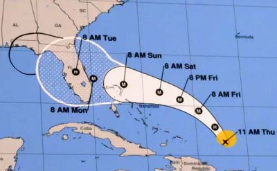
Then forward another two days;
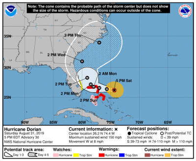
Finally, a week on from the Oval Office release;
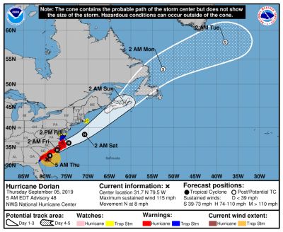
Compared to the original, there’s quite the contrast. The path of actual set against first forecast look vastly divergent.
Is this a way to drill down into future guestimates we encounter when selling?
Whether it be internal questions on our own sales deals forecast. Or projections within a prospect business case.
Hurricane Dorian was set to smash through the middle of Florida. Demanding the almost impossible of closing Disneyland. Yet within just a few hours, it tracked afresh in a brand new direction. Devastation thankfully averted. Perhaps we could just look at those figures again, mister prospect….