Google Career Guidance Slide Themes
Is there anything we can take from how Google design their webinar slides?
Let’s see if Digital Garage imagery can give any sales slide ideas.
First up, set the theme.
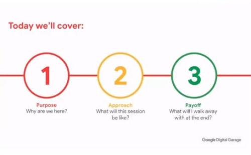
Purpose Approach Payoff.
Note the central line is a feature throughout. Alternating between their four bold brand colours. The one missing shade above, being the background below.

Although exactly why the long thin cuboid is anyone’s guess. Yet it is a framing vibe.
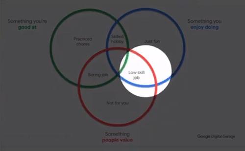
They like to use spotlights too.
Below an adapted ‘Ikigai’ diagram with triple Venn has one intersection shone on, when background muted.
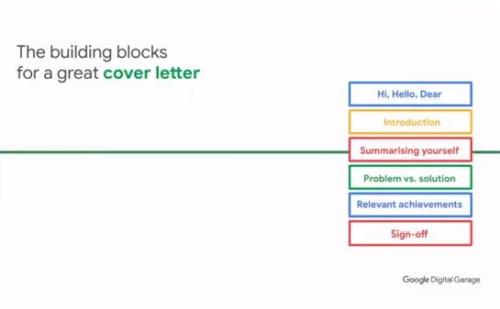
They have a few ways to deal with bullets. Boxes being one favourite.
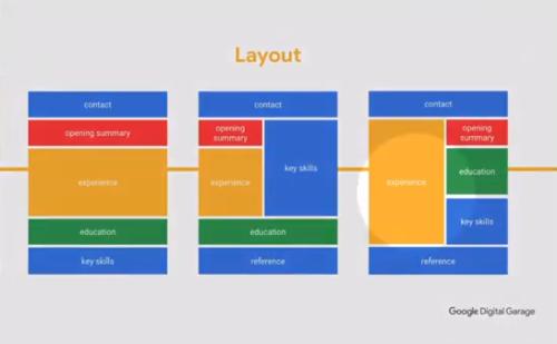
Then, from this example of CV (resumé) best-practice layout options, note how they use branded colour blocks to show proportions. (Screenshot mid-mute.)
And finally, what do you have in reserve for when a glitch hits?

The look remains consistent throughout. Even when they use what can only be said to be atrocious stock imagery with people posing in ‘work’ mode.
Still, a couple of ideas worth bearing in mind here.