Google EA '06 Strategy Grounding
How to present
— Gokul Rajaram (@gokulr) April 25, 2023
In 2006, I helped @ericschmidt create a deck outlining Google’s strategy, for a presentation Eric was delivering to the company. It taught me a profound lesson on how to present.
When I showed up to my first meeting with Eric, he asked me to visit with every…
There's a ton of this kind of User Generated Content condensing aspirational experience into pithy learnings online.
Not quite strictly UGC in this case I guess. As the author may well post to plumpen his proficiencies for promoting the global delivery ambitions of a local-business focused courier of which he appears part.
The takeaway? Use only imagery on slides.
He includes pictures, graphs and logos in this.
Hardly mind-blowing.
As it was a known expertise back in 2006. Even if sadly seldom practised in the general sales presentation populace. It was nevertheless not cutting edge technique.
By way of timestamp, I wrote my first pic-based salesdeck pitching Enterprise systems around '94. And won the order. In my first senior exec internal all-hands presentation, I supplied similar graphic based instructions to the slide maker around '97. When she excitedly passed word along, it rapidly influenced other speakers to overhaul their output.
Even so seventeen years on, it does bear repeating.
Especially in times of the virtual setting for first viewings.
Timely, as this missive (purposely?) coincides with Google's latest annual developer conference, I/O, just taking place.
The present-day chief Googler goes more for plentiful mini-animated shorts.
Here is though a sample still of what was pretty much his first slide proper. Ninety seconds in to the official Youtube upload of his address.
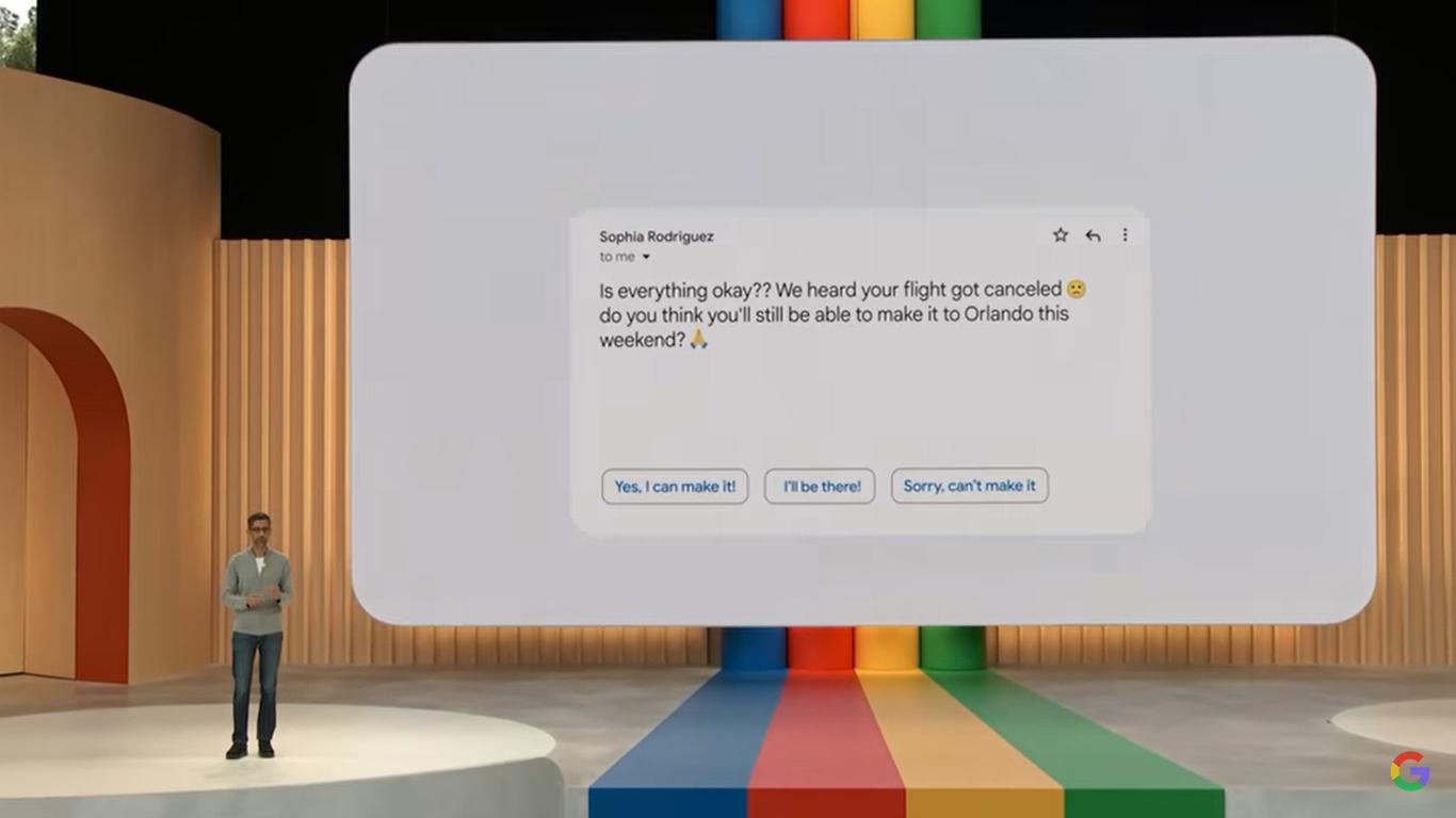
An image of sorts. There were better, later.
[Read my review of that keynote here.]
Texty in general is bad.
Bullet points loaded with lettering is badder.
A screen full of printed prose is baddest.
You'd think we know this today.
Let me shatter your illusion.
Alas, with a heavy heart I report that many a deck I've seen lately does not.
Not only does this ring true in much of B2B sales, but it also spreads to other business disciplines.
Which can have devastating ramifications for the slides of those you entrust to do your bidding from within prospect organisations.
Consider that.
As an aside, I went to b-school. Twice. Not a minute of targeted presentation training did I receive.
Someone should be ashamed.
After all, who signs up for corporate presentation coaching (especially for the salesteam) these days?
The only 'learning' method in evidence seems by watching others.
This is a glaring gap in the seller's arsenal. Worsened over time by its continuing widespread omission.
To step off my soapbox, none of this should lessen the fact that any slide you are designing, however slapdash or painstakingly, will benefit from the tests alluded to in the above tweeted memory.
It's also worth mentioning that his tweet is mistitled.
It is not about How to present.
Let's swap out that word 'presentations' from his summary.
4 principles for delivering compelling slides to live audiences
It is about How to make a slide.
There's nothing on theme, story, angle, framing, thread, purpose, pay-off, length.
Nonetheless, a sanity check for that deck you're working on right now.
Although at least we surely snigger at his third point's wail at that colleague, who "flaked at the last minute".