Google I/O Conference '23 Keynote Slides
My recent post brought about via a one-time slide maker for former ceo Eric Schmidt reminded me of a blog I posted five years back. Time for an update.
As for the current chief exec, an ace presenter he is not. So you might say he needs his slidedeck to help do his talking. Which in this incarnation, turn out to be less slides, more mini-animations.
Let's take five of the more static stylings from his 2023 developers show keynote which might be adaptable for our next set of slides or deal imagery.
Numbers
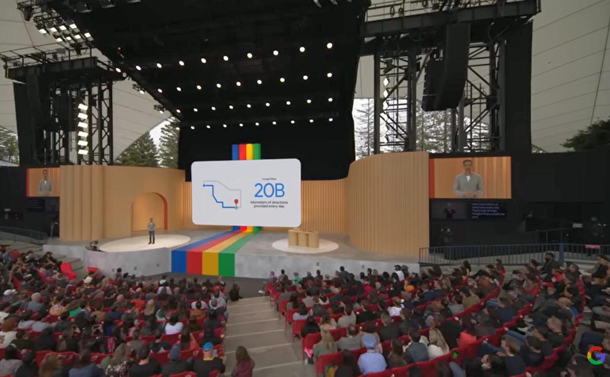
They prefer to show a significant numeric within a touch of context. First seen, with perhaps muted highlight.
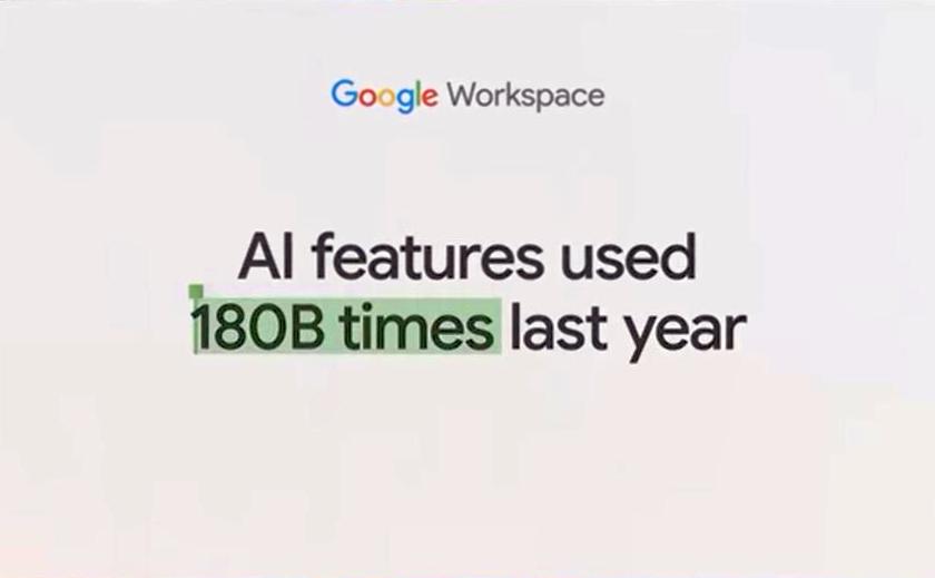
Then alongside a related, (relatable?) icon of sorts.
Before writ large, the centre of brief text.
In a strictly Sales sense, delivering a metric - a figure that gets across the power of your wares - is usually at its best when the amount is the last 'word'.
In their cases here, you could stick with their format for the larger font sized pair. But the first one would I think benefit from switching the sentence around, as; AI features used last year 180B times.
It's notable I fancy that each one is presented slightly differently. More chance of (each?) one standing out in the mind of the watcher. As well as keeping things fresh.
Before/After
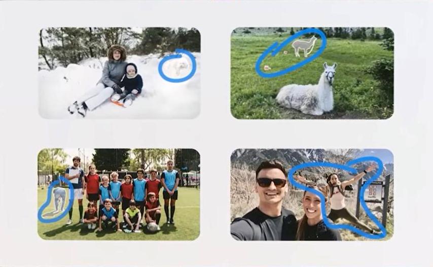
They touch on this reliable tactic to announce an upgrade on their photo 'magic eraser' feature, mixed in with their Snapseed 'healing' functionality. Three snapshots of their animated sequence show the way;

Missions
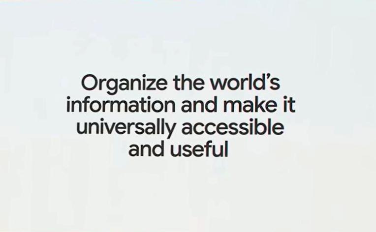
They've long tended towards understated sized icons. A trait which extends to when they want to show text. Here's their reminder of how they believe their vision remains as relevant today, as it did when coined many years back.
For good measure, here's the subsequent breakdown of their AI ambitions.
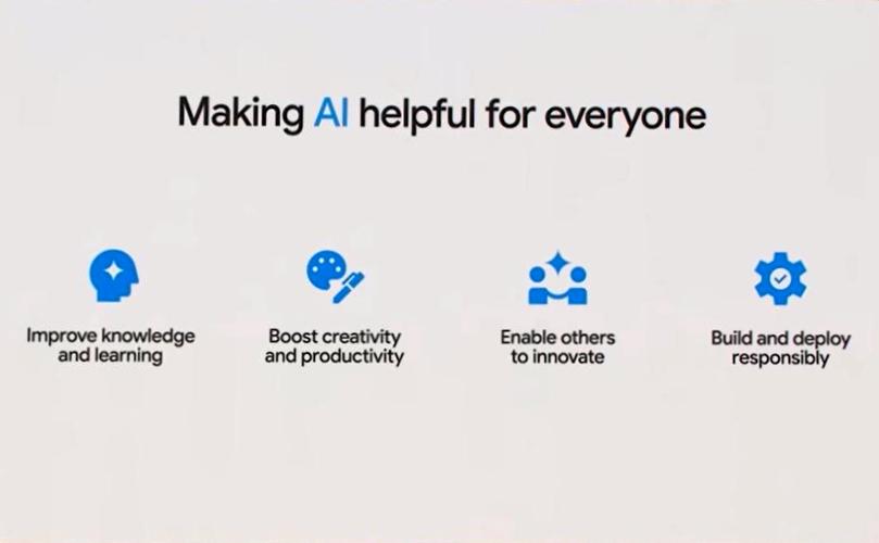
To which it's worth adding a slide slipped in later promoting their AI credentials (under-fire after being soundly beaten to the punch by Musk co-founded, Microsoft funded OpenAI). Showing a modern way to list bullets.
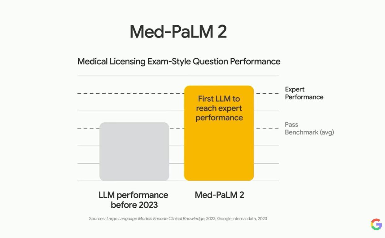
Graph
There's a sole, simple barchart on offer. Aimed at showing the pace of its AI. Supposedly now outstripping mere humans.
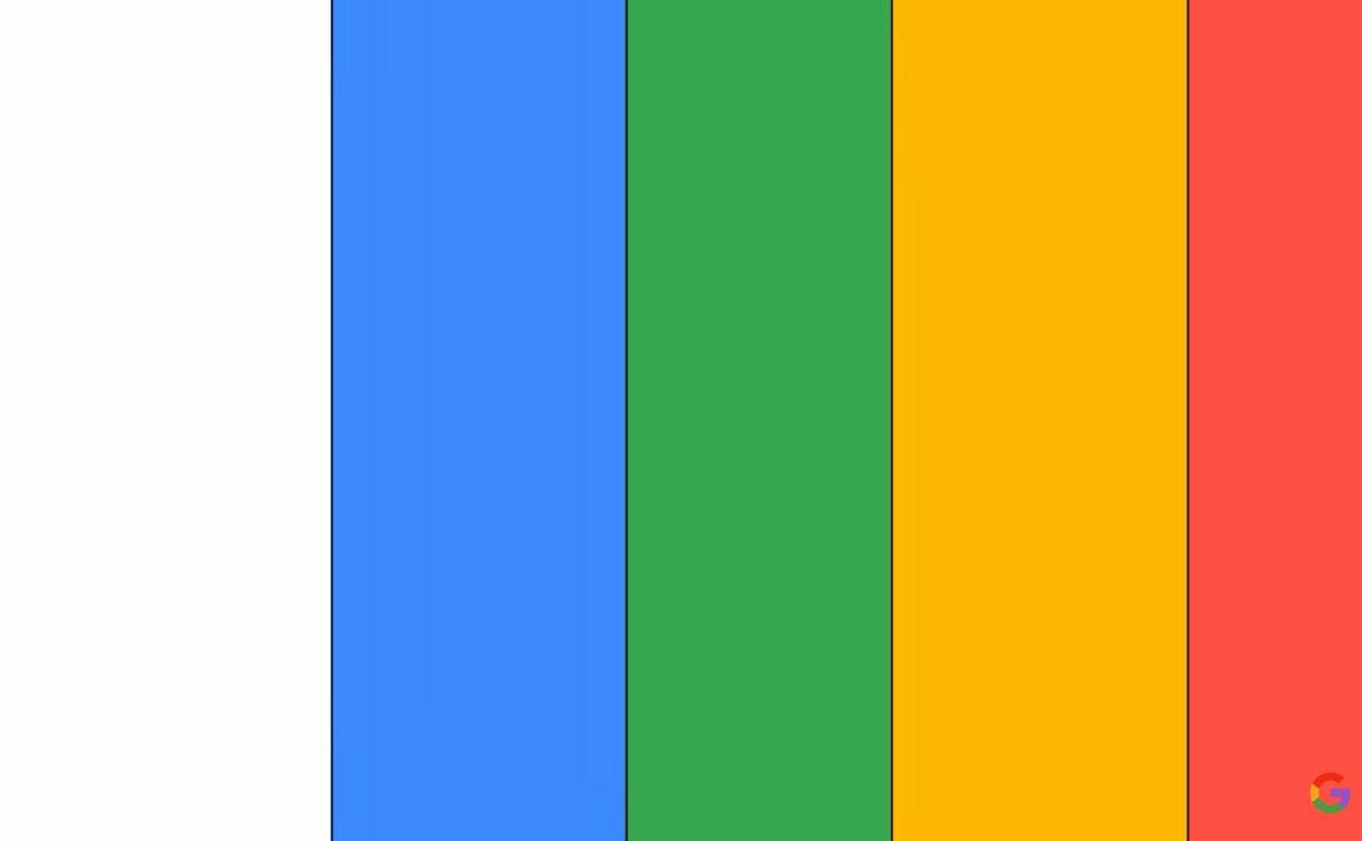
Corporate Palette Bumper
Whilst in the main they leave the splashes of colour to interspersed mini-demos of apps-in-motion, there is an overall branding glimpse of how they bring the curtain down on this video.
Full-length stripes of different and varying width clear the screen, moving from left to right.
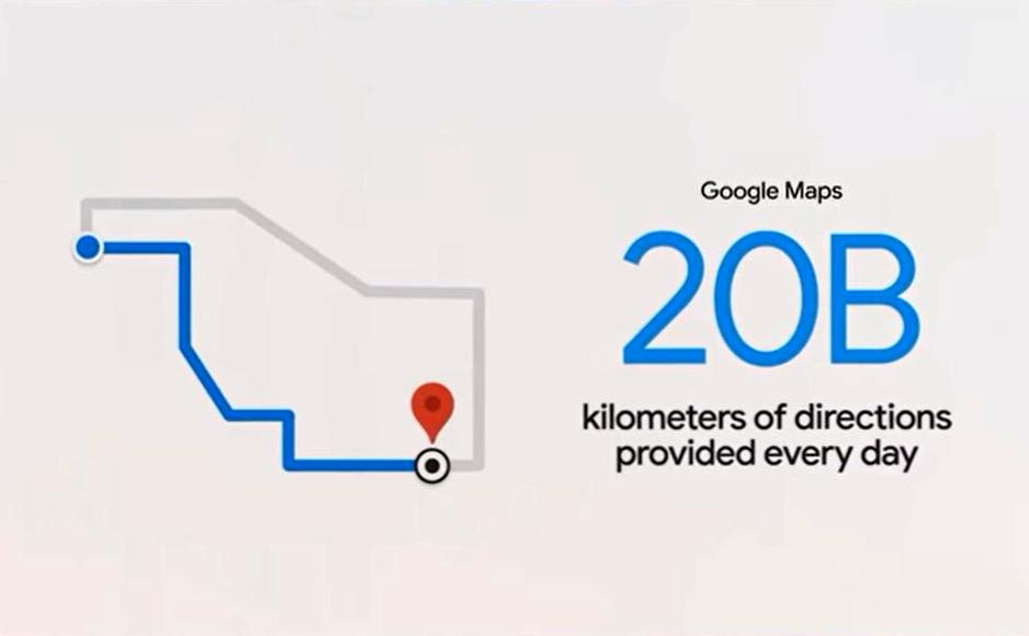
And sort of linked, as a bonus, here's a reminder to consider how your slide might look to the audience. Featuring the 20B figure from earlier, in auditorium setting.
Which allows me to try and riff on that central stage piping branding quartet. Here in my Video Calls That Sell palette. Which might make for a useful blank separator or sectional title background.