Graph Onions
No, not a post about an onion graph. One inspired by traditional line graphs, rather than trendy modern-day nested circular ring charts.
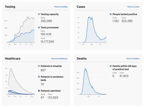
The image up top is from the 20 August 2020 daily update of the UK govt pandemic graphs page.
Such a matrix of graphs is commonplace among slidedecks.
Standard ‘slice and dice’ options are available.
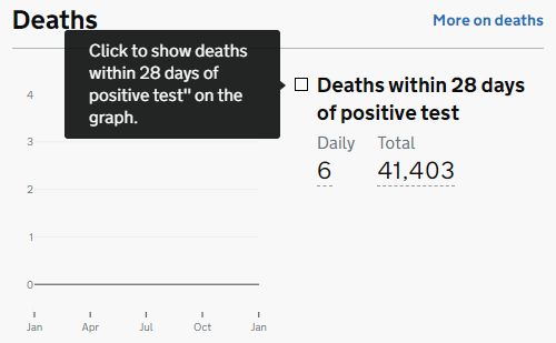
Clicking a field allows for showing how the replaced measure currently only counts deaths within a 28 days span following coronavirus diagnosis.
You can also click through for ‘more’ details.
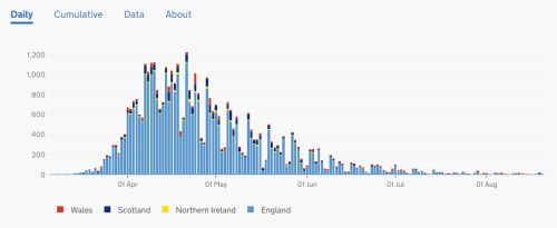
Hovering over each bar for that day’s actual figures. The most recent sadly seeing 6 deaths. Although mercifully down from the raging peak.
Yet this is a veneer of transparency.
It does not permit any type of interrogation that is insightful or desired.
The explanation is repeated;
Number of deaths of people who had had a positive test result for COVID-19 and died within 28 days of the first positive test. The actual cause of death may not be COVID-19 in all cases. People who died from COVID-19 but had not tested positive are not included and people who died from COVID-19 more than 28 days after their first positive test are not included. Data from the four nations are not directly comparable as methodologies and inclusion criteria vary.
Which makes you scream at the screen for a truer breakdown.
For which fatalities are there only the single cause of death of ‘covid’?
What’s the split by gender? Age? BMI? Or other key co-morbidity?
Even separating out care homes. As we suspect the National Health Service fell into the NY trap of Andrew Cuomo and merrily sent infected people away from hospitals back into elderly care homes wreaking coronageddon and somehow still demand we think of them as saviours.
Each graph can give rise to similar data-hole frustration.
Why not positive test outcomes and hospitals admissions shown together?
What about more than only ‘ventilator bed’ occupants? Especially when the kind of CPAP, non-ventilator assisted breathing which aided the country’s Prime Minister seems a much better treatment than hit-and-miss, possibly not even effective, coma-inducing, lung-taking-over ventilators?
Many a graph will generate deeper questions. Make sure you’re ready for yours.