Indicative Graph Shenanigator
![]()
This think tank knows the value of the more unconventional graphic. It is a mindset we’d do well to embrace with our presentation of numbers. (Please don’t be put off if you’re wary that they’re Leftist and Europhiliac; it’s about our data.)
I constantly rail against the low standard of ‘microsoft wizard’ charts I see in slidedecks. Yes, there’s often quite a bit of effort involved in making something different – and we are not all blessed with technical and illustrative skills which is likely why we are Salespeople, not graphic designers – but there are significant and deal-making prizes to be had should we venture beyond the thirty-second pie, bar or line.
Here’s three examples of theirs to consider from what they created around the brexit Westminster Parliament Spring 2019 ‘indicative vote’ ridiculousness.
Let’s start with depicting how much time the UK’s legislative body spent on the various topics at hand.
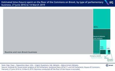
The “treemap of sorts” popularised for the social media age by David Mccandless a decade ago. Like a waffle chart, useful when values at the extremes of macro or micro would swamp or be obscured within such as a bar or pie.
As an image here it also lends itself quite neatly to landscape screen projection.
Whether it adds or detracts from where the green oblongs sit on the three bears’ porridge scale of too little, too much or just right though, is perhaps a little red riding hood less clear.
Next, the first effort of multiple choice motions. Here, comparison between the most viewed English language news site and the think tank’s second representation. When they re-ranked from voting order to ‘aye’ outcomes.
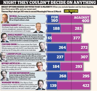
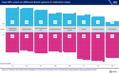
Quite the coincidental colour schemes there too. The latter is also akin to barcharting around a shared origin.
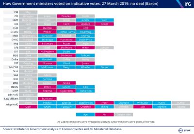
And thirdly, a status representation. The detail doesn’t matter so much as the split shown by the spread of colours.
I was reminded here of a slide I produced lately showing close-date accuracy of an historic monthly forecast for a salesteam. There I used contrasting shades and tones to display in similar tabular form according to both deal size and sector. The idea in part being to help spark a discussion to isolate the true sweet spot. Readily applicable to enlivening a list you may have thought restricted by such as chronology.