Isotype Graphics
I get highly agitated when I see yet another bar or pie chart thrown my way during a presentation. Aren’t we all bored silly by them? Especially when the main point they attempt to make is often blurred to exclusion. So I keep a constant eye out for better, alternate ways of data representation.
Imagine my delight when I happened across graphs using isotypes. A wikipedia definition:
isotype (picture language), a method of showing social, technological, biological and historical connections in pictorial form
A pleasingly design obsessed blogger sums up the broader insight required.
The Isotype project was “set up by Otto Neurath to provide information to the often-illiterate proletariat”
In other words, it sought to conceive ways of getting (possibly complex) information to be understood and remembered by those not necessarily predisposed to do either. Sound like your last presentation brief?
How familiar is the following application of this style to you I wonder? Its Viennese creator manages to introduce several perspectives to the data series, which concerns Soviet crèche growth.
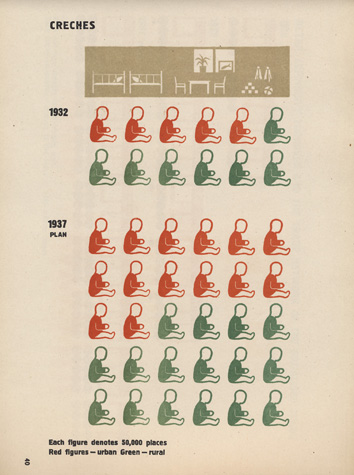
Three worthwhile pointers instantly emerge.
- it deals with a future scenario
- each baby represents a set number of crèche places; 50,000.
- two colours denote either rural or urban locations
I do like the way it shows a projection. Picturing a hoped-for plan is ideal for this treatment. As for the images themselves, the reasoning behind each unit’s designated value could be interesting. Perhaps they worked back from the total numbers, maybe they divided them by a wholesome roundabout number. If you think about the rough integers involved, 600k and 1½m are the total figures, so alternatives to a straight 50,000 were available, but it does seem they chose wisely. And a neat use of two colours; agricultural green for in the fields, communist red for the cities.
Extending this mindset to sales presentations seems fairly straightforward. Particularly useful for forecasted growth and increases, and anywhere two or three different types of reason or subsets exist.
I did get to thinking how tricky or time consuming doing this yourself might be. So I set about doing a mock-up of this same pic myself. Quick and dirty for sure, it took me less than ten minutes and just one large mug of green tea.
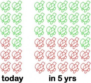
For those interested in the technicals, I adapted the pram icon from another isotype pioneer, Gerd Arntz, using IrfanView and slapping it into Powerpoint. And if you need a reminder as to how much more punch this style packs, then using the same data series again, here’s how 60 seconds inside Powerpoint’s chart wizard can corrupt you.
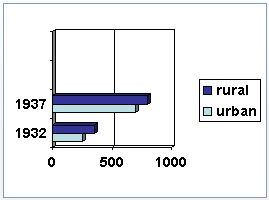 Yuk.
Yuk.