Learnings From A Day Of In-Field Instagram #Presentation
There I was. In the not unfamiliar position of waiting for an over-running conference session to finally end.
I duly spent a quick few minutes swiping through what had been posted recently on Instagram with the hashtag #presentation.
Once stopped I noticed that I’d covered all pictures shared over the previous 24 hours.
I was intrigued at how few photos were actually of the projected messages that I was hunting out.
The 2.0 term ‘presentation’ seems to have considerably broadened its net lately.
Still. Gnawing away at me, I went back later to check my sanity.
During that midweek day-long period, only ten postings were of an actual presenter stood proudly aside their slide. There were a further handful of intro and thank you slides. With a few more of work-in-progress desk-bound computer screens.
I chuckled to see someone upload a poster of the famous Churchillian wit;
A good speech should be like a woman’s skirt: long enough to cover the subject and short enough to create interest.
But back to that ten. I was startled to note that being stuck in the Nineties prevailed.
Lots of text. Microsoft wizards at play. Plenty of bullet points. Mainly light backgrounds. Not a single standout point. And even more text.
Arrrrrgh.
Not all the ten shots are close or focused enough to make out the slide detail. Yet I have managed to isolate imagery representative of them below.
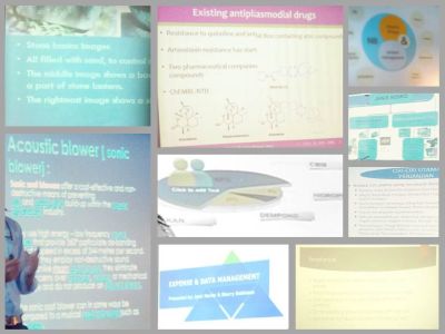
If any of your slidedeck looks like these, then you must redo.
Think photos. Newsprint headlines. One point per page. Colours. Less words.