Leftfield Graph
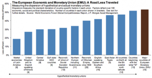
Here’s an entertaining bar chart.
Yeah, I know it’s about the Euro. Not everybody’s riveting cup o’ tea. But the point is, look at what the comparisons made are.
When we as solution sellers put up such bars, we seldom show this sort of creativity.
What else could you compare with? If you sell on productivity gains, then where else in your prospect is productivity measured? If you sell on cash returns, then where else does the dosh come in so?
Also, what a delight to see this as a standalone paragraph.
And here is your tweetable fact:
A monetary union might make more sense for every nation starting with the letter “M” than it does for the euro zone.
Reminds me of a recent post of mine too.

