MWC 2019 Slide & Display Trends
From a viewpoint of what we might take for our own solution sales presentation, recent Mobile World Congress graphics have become fairly underwhelming. About time for an update on my previous entry.
Firstly, I always like to see the odd word and number writ large on a pic. The organisers continue to enjoy this reliable trope. Yet we can do better than a stock cityscape surely:
They also show use of a central hexagonal theme this year. Used to house many of their messages, including panel portraits and general title slides;

Yet sadly, they do suffer the occasional mis-step on their social media content;

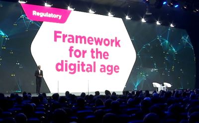
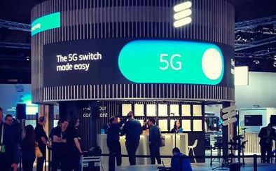
Still, overall, the paucity of interesting charting remains. Many big players opt instead to use advertising banners, splashed liberally across their output. This year, random-ish arty imagery seems popular. Here’s Ericsson, EY Consulting & Arm stand design;

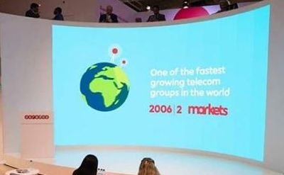
As for actual slides, here’s a quartet worthy of note. Two decent, two not so. Firstly, Qatari telco Ooredoo trumpeting their growth since a 2006 snapshot;
Then how about the Microsoft ceo channelling Apple Stevenotes:

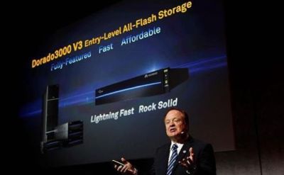
Next, a fail of how not to do a product slide, courtesy of this storage ad;
And finally, a reminder old school black bullet text on a white background is still used. No matter how worthy or otherwise a cause, this sadly does not work;