Numberline Difference Data Storytelling

Here’s a great graphical technique. Be aware that it can take up quite a large chunk of your downtime. But when done well, it can be a real pitch winner.
The numberline.
I was reminded of this when seeing Newsnight’s explanation of where American pollsters got the Presidential vote so 180° wrong. The screenshot above shows a close-up of the Republic candidate share across each US state last time out.
At the far-left of the line Washington DC saw Romney poll just a draining 7%. Far-right, Wyoming 2012 scored a swamping 71%.
Expected versus Actuals makes uncomfortable viewing for an entire industry of market researchers. So the numberline treatment means you move each starting value up or down in the direction of how they’ll differ. First, the guesses:
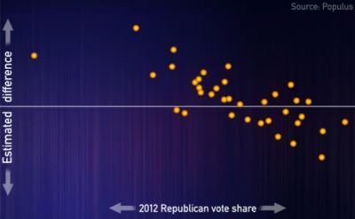
It seems lots of heavy losses looming. Now what really happened:
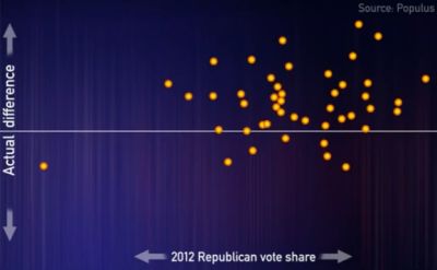
The visuals are damning. Any shift towards a top-right corner and there was only one winner. Totally missed by the “professionals”.
I blogged on these despicables last week. Here, my point is the presentation.
Some of the best graphs which make your key selling impact achieve the magical. They tell stories. Data alone is never enough. Waterfall bar charting is one excellent way to do this. And here’s another in numberlines.
Think uncovering trends. Any chasm between perception and reality. Track records of forecast against results.
You won’t be able to deploy them on every deal, but when you can, putting the extra effort to make them will truly set you apart.