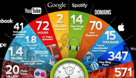
Numbers An Audience Will Remember
347 new posts are added to blogs on the wordpress blog platform (which I also currently use) every single minute. I know this because of the above infographic.
It features 19 separate facts, each meant to show just how massive is our web creation.
I was drawn to how different the impact was from the full infographic, compared against the one presented above. The latter is almost a template for a decent summary slide.
A fortnight ago a blog of mine touched on using sets of words to highlight a proposition’s merits.
Yet this treatment reminds me that you can attain similar punch using numbers.
Especially as when many buyers may find that figures stick in their mind better than words.
I duly dug up this slide below. I made it myself many years past, as part of a project intro. My aim then was to use a set of numbers to help convince how necessary the overall undertaking would be.
I’d do it a bit differently today if time constraints permitted. The types of numbers should be mixed and varied (not all percentages like here – use proportions, fractions even, monetary amounts and times for instance). As well as perhaps differing in font size too.
But at the quickest entry-level, even this basic presentation still allows for a nice big relevant image alongside a slew of compelling, intriguing figures to be brought to the audience’s attention.


