Quarterly Sales Meeting Slide Distraction
Wintering in the colonies means suffering the appalling customer ‘service’ of local tv provider dstv/multichoice.
They run plenty of glossy ads promoting their add-on wares.
The 30-seconder above was first shown around December 5th.
How can you not like an ad that shows a quarterly sales meeting?!
It all seems uncannily familiar.
Attendees look duly uninspired.
In a typically soulless room.
Which also feels cramped.
The graphics sadly standard.
And it ends with a reveal that the person in the back corner was permanently online, attention elsewhere.
There’s a lot you can pick out of that.
Let’s solely deal with the graphics here.
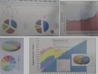
Below is a collage from my hazy screengrabs of the offenders.
Pies and bars used with little imagination.
Straight out of the on-board ‘wizards’ that constrain the unwary worldwide.
They falsely appear fairly adept in their production.
So it shouldn’t take any extra time to add sparkle.
Mix things up a touch.
On instagram I post several ideas for alternatives.
Each quick and simple.
Take a different approach and your charts and message will hugely benefit.

