Quick Magazine Cover Mock-Up Workshop
My presentation post yesterday inspired by Time Magazine’s latest ‘person of the year’ image reminded me of a documentary I saw recently following upmarket London glossy Tatler.
Journalist desk spaces abound with mock-up magazine covers.
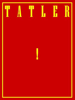
I chuckled at one that was simply a red page, and under the title banner a simple, central, small yellow exclamation mark.
Then I remembered from my misguided youth when a writer left the country’s then biggest-selling pop music mag to become a popstar himself. He was presented with a mock-up cover as a leaving present. Allegedly including one headline from a stock phrase of his, “hey, it’s just like punk never happened…”
There’s a (whisper it) Marketing-style exercise you could do with or as a salesteam. It applies especially for any ‘new’ initiative. So not just a product launch, but any re-org, merge or mission revamp.
Ask teams to go away and mock-up their own magazine cover.
With five minutes prep time to go make sure they have a clean flipchart sheet handy to start scribbling the final cover upon.
You can give guidance. Even use that month’s examples of favoured mags from almost any subject.
The different types of messages the pros use to encourage a purchase can certainly be cunning.
Then when they come back and share ideas you’ll see what they think is most important about your initiative from a “reader’s” (prospect’s) view.
One reason why this is a touch marketing is because you can categorise straplines created on an AIDA scale (attention-interest-desire-action). A classic marketeer’s lens.
And with a bit of luck, you’ll gain winning morsels the whole team can devour.
..and just for confirmation, the Tatler example I referred to would NOT make an acceptable team output!

