Rabbit Hole Slides

How does Hollywood portray business presentations?
If you like to see what filming prop, set and styling designers conjure for supposed bleeding-edge, latest bang-on trends for inspo, then you might be in luck with 2023 series, Rabbit Hole.
In the first episode, our 'hero' John Weir (Kiefer Sutherland) delivers a pitch to his team. Explaining the shady remit commissioned by one nefarious mega corp to secretly engineer catastrophe and cheaper takeover of another.
We see a pair of slides.
No attempt to pay much heed to them really.
It's all about the spoken delivery of message.
They seem like mere presenter prompts.
Not much design time likely gone into them.
Yet still of a vibe.
Given the office environment is one of eye-watering deal values and tech so cresting wave it's beyond military, can how these are done influence our next couple of such in a good way?
Here's the first.
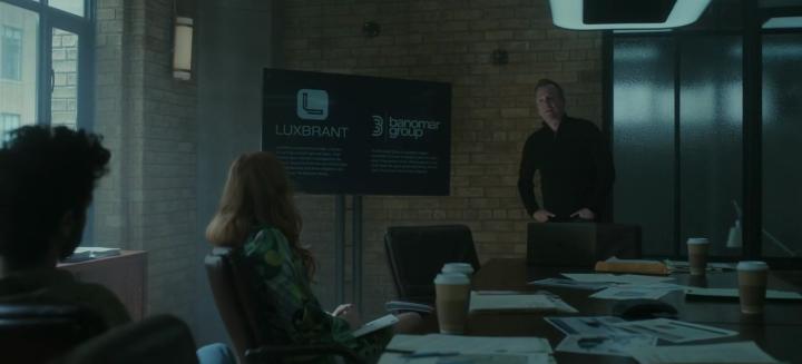
Screen not all that large. Room corner positioning, both anti-daylighting glare and allowing speaker to take centre-stage.
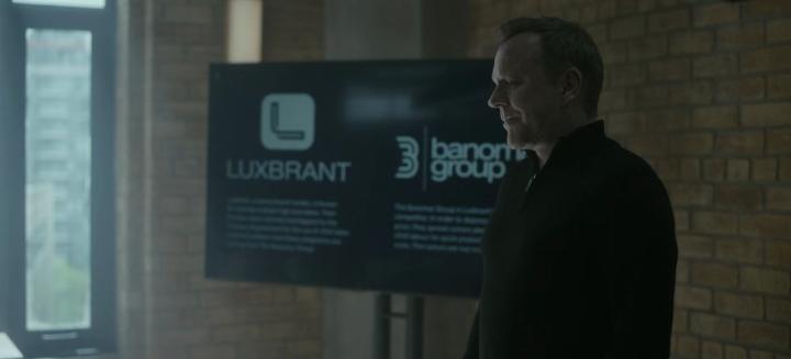
Setting the scene. Detailing the two companies involved.
Each takes a vertical half. Lots of text there, hey.
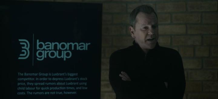
We also glimpse a brief close-up of one half.
But that text isn't really important. The speaker covers it all in their own manner.
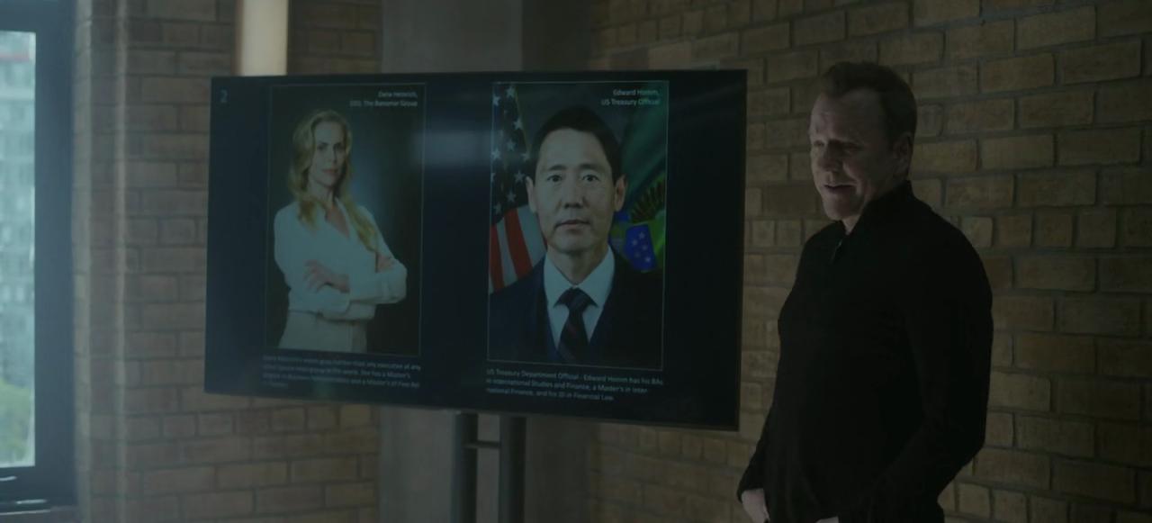
Then there's photos of the pair of people at the heart of the sting.
Corporate pics. Lifted straight off web portraits. Bio underneath likewise you'd guess.
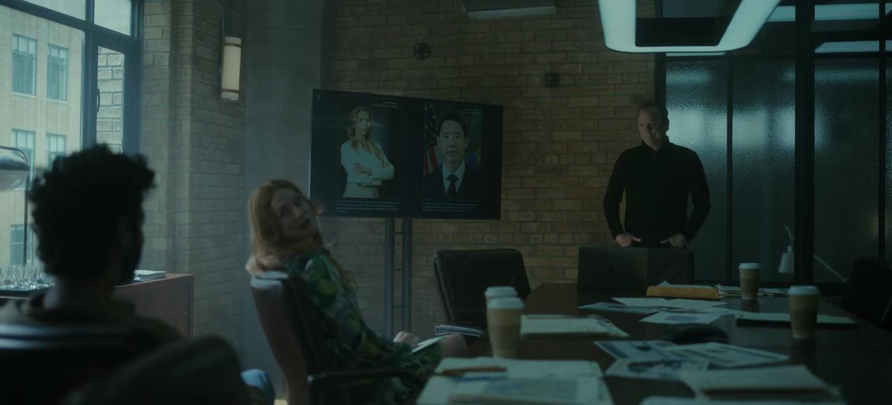
That little font again. Not really intending text to be read by any audience, even in a meeting room this relatively compact.
Both these slides seem quick to assemble.
Always like the black background.
Converting the corporate logos into black and white works well on the first one too.
The whole sequence lasts a touch under three minutes in the show.
A slide each ninety seconds, ish.
And the outcome aimed for?
"Any ideas?"
Sadly we only really get one from the team. Swiftly knocked down. But in reality, "it's a trick question..." The speaker already knows what to do.
Are our mini-sessions ever the same?
