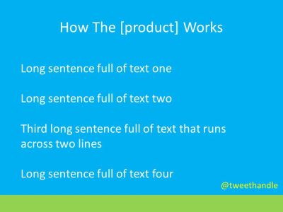
Slide As Coloured Text Doc
This is an abridged replica of a real-life slide. The bouncy Millennial showing it, talked whilst mostly looking at the screen, rather than audience. Repeatedly tasseling her hair, giving an air of indifference.
Although not impossible, it is extremely hard to ever justify a place for such a slide. And certainly never for said delivery.
There’s a total absence of any elements of persuasion or imprint.
The title first. Does your slide even need one? In fact, if you ban titles as a pedantry diktat from your Sales decks it’s remarkable the improvement you’ll unleash.
In this case, it isn’t about your product. It’s about their answer.
Then we come to the text. Just because lengthy prose is shorn of the starting bullet blot doesn’t make them miraculously acceptable. Not even an attempt at headlines here. And why a quartet? Such an ugly number for a list.
I yearned for any form of diagram. If you insist on a foursome, then how about a 2×2 box? A classic triangle, using each vertex or side with middle space or external extra?
Branding. I’m with the school that rails against each slide having your treasured stamp repeated as some misguided badge of pride on every turn. Twitter address included.
This treatment feel familiar? If any of your output looks like the pic up top, then make the time to mix it up. As a priority please.

