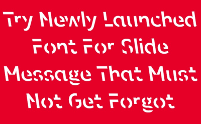
Try Newly Launched Font For Slide Message That Must Not Get Forgot
How about this. A new font to help us sell.
Choosing the typeface for our deck’s text is almost univers-ally (geddit?!) easy.
Defaulting to Arial pretty much exclusively. Or at the very least, your own ‘sans serif’ (anything without those flourished curly stroke endings) such as Verdana or Calibri or another Helvetica-Swiss selection.
The difference comes from occasional deviation for a corporate font diktat or lending from a relevant piggybacked zeitgeist design.
And courtesy of Uni researchers in Melbourne we now have a promising case of the latter.
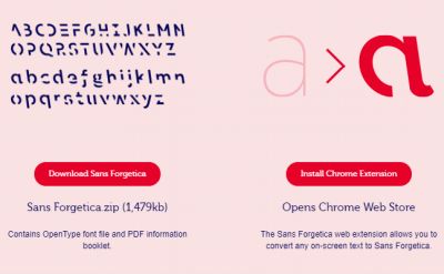
They’ve developed what they assert is a font that better helps the brain remember what it reads. Sans Forgetica.
Particularly when it comes to taking in study notes.
As you can likely tell from my image up-top, there’s plenty of stencil-esque gaps among each letter’s lines.
But that’s not their sole trick.
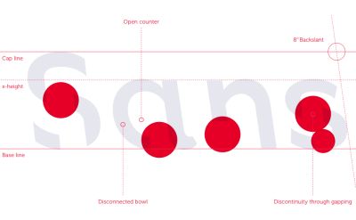
This “discontinuity” feeds “disconnected bowls” and all at a “backslant” angle of 8°.
Their work is free to download at my time of blogging.[*]
It’s a lovely idea to write a key message in this font on a slide for something you do not want your audience to forget, for something they must absolutely remember.
Couple this with recounting some of the story on why this font’s got developed and you should have provided an extra hook for their memory.
From the creators’ website;
The science of Sans Forgetica:
Sans Forgetica is more difficult to read than most typefaces – and that’s by design. The ‘desirable difficulty’ you experience when reading information formatted in Sans Forgetica prompts your brain to engage in deeper processing.
Engage your audience in deeper processing.
You could even have it among vertical lines at their chosen 8° backslant angle for extra compatibility.
Use your own colours, not necessarily their preferred pink backgrounded deep blues and reds, and hopefully better let that key point stick.
* a note on the technicalities –
if on a MS machine, the OTF file you extract from their download zip-pack is the one you simply drag into your Windows>Font folder;
then when you next go into any Office program, Sans Forgetica will appear as an option in your font selection drop-down as you’re likely used to –
if any of this preceding sentence is ancient greek to you then a trusted colleague, teenager or youtube should sort you out