Web Juggernaut Likes Nineties' Slides - Can We?
I feel transported back to the craziness of the original dotcom bubble.
When countless hours – and way too much cash – got wasted on ‘fixing’ a millennium bug that would never have bitten.
A time when the upcoming €uro single currency would herald a new world idyll.
Where clipart and Microsoft’s ‘chart wizard’ appeared in every single slide presentation.
Ew.
Yet the Anglosphere’s most visited news website harks back to such days with its graphs.
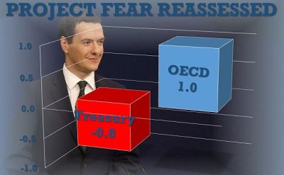
As seen above, clunky imagery is quite happily the Mailonline’s visual of choice.
In this particular image, they gloat that the doom-mongers who said Brexit would cause WW3 are already being proven wildly wrong.
Always worthy of note in itself.
But I wonder whether we’d get away with this treatment in our solution selling decks?
A not especially good photo as backdrop (why would a chief architect of the macrosleight be smug?). Data sets that could be shot down (the OECD also made up apocalyptic pre-Brexit numbers). Random colours couple with dodgy text labels and baffling 3D-ness.
I doubt it’d fly for us today.
Yet is there something comfortingly old school going on?
And if the Daily Mail deploy it to get their point across – despite my doubts – maybe there’s something strangely useful in it we could borrow too?