What Would Your Clients Expect For Almost Three Grand A Pop?
I came across a piece of MSM PR for taught courses passing on know-how of being a Football Agent by a one-time practitioner.
An online search on this particular protagonist brings mixed reviews. So with veracity of offering and offerer obscured, let’s keep this as anonymous as possible.
What triggered my Sales antennae, were pics of the in-person coaching sessions.
Who doesn’t love a little glimpse behind the wizard’s curtain?
A 2-day package of this below (from the website itself) will currently set you back (an eye-watering) £2,750.
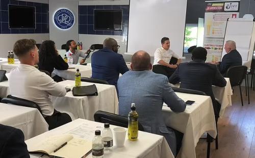
Venue
Let’s start with your berth for the day. A conference room at one of England’s historic football clubs, nicknamed The Rs or Hoops.
Good choice.
It would make an impact with target audience no doubt. Also associating the presenter within the apt environment.
On a personal note, I know from my own career how easy and useful it is to use a sporting arena for a business gathering. They can be hired out by anyone in the week when there’s no game on. Punters tend to turn up smiling.
An increasing range of interesting places are lately keen to open themselves up for such use (and revenue generation). It would be understandable if such thinking gathered pace in our now less-office shackled world. Take the opportunity where booking fees and intrigue allow.
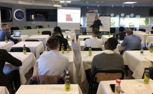
Seating
There’s a dozen delegates in frame. Perhaps one or two more cropped from view. With seats arranged like back at school. Likely twenty spots in a 4×5 grid.
This set-up though is all wrong.
Both numbers and space make ‘the well’ ideal. The formation of seating (and tables) that give rise to the classic ∪-shape.
You want everyone to be living inside your role play. Truly soak it all in. Yet as depicted here, less students can really see what’s going on than sadly cannot.
Slides
Lastly, we must talk about the slides. Here’s what’s shown on the projector in this class. Pinched in just enough to make it out.
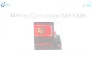
It places teacher in-situ at renowned stadium for credibility. Yet presentation of such a concept leaves a fair bit to be desired. The old bugbear of taking up (any &) too much screen real estate with your logo resurfaces.
And perhaps here is a classic example of where a single image of the photo taking up the entire screen would be perfect. If you must, pop the word CONNECTIONS on it somewhere near the bottom relatively subtly in, say a lighter font.
You might even say, materials maketh the mentor.