Why The Same Three Angles

This selling trap comes to me from a commonplace photography flaw.
It seems that when taking holiday snaps of landmarks, the average person is – in the eyes of the pros – distinctly average.
The planet’s marvellous scenic delights are taken by the vast majority of tourists from solely the same three angles.
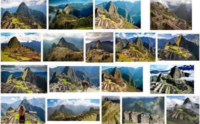
See for instance Machu Picchu. Above is a screengrab of the day’s top google images results. A randomised example yet you still see the predominance here of just one frame (and sadly only one llama).
Even my personal favourite, Table Mountain, suffers with just two shots overwhelming all other; taken at distance from either Table View across the bay or the Waterfront shopping/leisure space.
You feel the paps are a little harsh here. After all, it is a singular famous view that makes such places iconic. Yet there is definitely something in trying to mix things up a touch.
Firstly, in selling in general, are we guilty of viewing a prospect problem from the same obvious angle? The one our competition looks from. The one the top brass is tired of being told about. The one that doesn’t show us in a starry spotlight.
Then there’s slide pic messaging. Are we showing ourselves in distinctive terms if we present the same stock image treatment people quickly forgot even back in the 90s?
Close-ups, micro-details, reflections, inside-outs, mundane-as-important.
Where’s your llama?
