Windoze Agenda Slide Trap

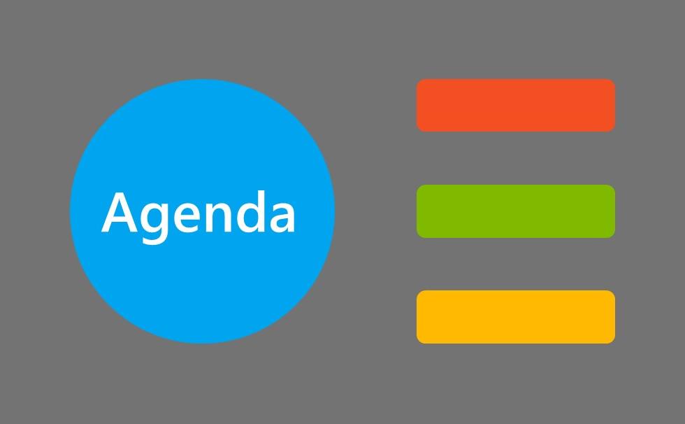
A while back, I saw this above slide template.
Awaiting a small working party. With whom I had no dealings. Their get-together about to commence.
For aesthetics I've switched their white background to grey. Kept the big 'Microsoft Blue' circle with its contained title as-was. And swapped the position of the trio of fairly generic accompanying statement text sub-headings for oblongs in the remaining three MS corporate colours.
This is almost as far away from Agenda best practice slide work as it is possible to be.
Yet completely understandable.
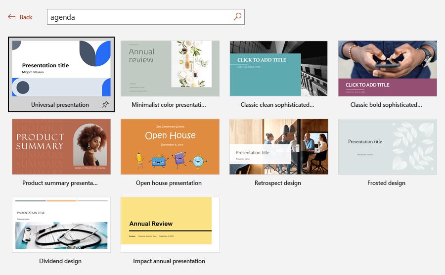
Type an image search for anything resembling 'agenda slide' and you'll see the issue for yourself.
Indeed, within Powerpoint itself, here's one sample of what you'd find.

I know from my recent experience of running workshops on harnessing the untapped power of Agendas - from the freshest to most seasoned of execs - that as a lever for enabling motion, it is a toolset widely neglected. Especially saddening given it is ideal for making the best of progress when over video.
I did wonder whether the format I witnessed was the author's own treatment, or that mandated by some organisational diktat.
Yet that hardly matters here.
Mainly because neither tech prompts nor design trove really helps.
The very exhortation to provide a 'title' means you begin on the wrong foot from the off.
ᴀɢᴇɴᴅᴀ is simply just not a winning slide title.
You'd be wise to banish it from appearing on your slides.
It's not necessarily the big circle that's the issue up-top.
This was the first slide. A placeholder, sectional title, and information starter all rolled into one.
Regardless of the adjoining trio of written steps, one change alone would elevate the whole endeavour.
Consider the purpose of the meeting.
Turn that into a question.
One which you intend for the forum to resolve upon completion.
That's what should be in the blue circle above.
Then when wrapping up later, check back.
Did we answer the opening question?
