You Gotta Show A Map
I always smile when I see a Powerpoint slide make international news. How can we forget Michael Jackson’s striking vials? Or the embarrasingly amateur American Prism snooping deck?
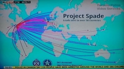
It was terrific to see three diligent years of detective work pay-off so rewardingly for the Toronto police this week. I took this shot above in front of a big telly on a rolling news channel.
As they explained the extent to which they’d busted one of society’s most hated crimes, they produced their global slide.
It clearly depicts where the web of evil spread from its Canadian den.
Applause all round.
Now, I had one role back in the Nineties where we used to joke about our corporate presentation.
You just had to have a map.
Presentation rehearsals (yes, they do exist) revealing ‘the map’ would trigger audience cheer like a pack of gibbons on heat.
If you didn’t show the world, and plaster as many big red markers on it as possible, then you were not a serious vendor.
That was the theory, anyway.
Yet looking back, this faux demo of global power is all a bit unnecessary.
I’ve seen big ticket overviews – 2D planet and all – where I sense the prospect is actually turned off by the worldwide-liness. They often only care about what you do around their locale. They even consider such presence a potentially damaging distraction. Why care about their neck o’ the woods when you have New York. Or Beijing. Or Timbuktu.
The point of such a map is to show success, yes. Stability, growth, or anywhere inbetween. Look where we’ve been. Look where we’re going. But does such a map really give the prospect any real feeling of warmth?
By a strange coincidence at a similar time I also saw this map of the European neighbourhood. The project aims to show how and where words come from. Here’s the story of ‘beer’ (I came across this via the often rewarding Datablog, it’s advisable to click through and see the map in full glory).
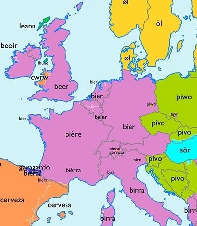
Fascinating etymological insight.
The Toronto slide works so well because it shows the reach of their heroic endeavours.
The wordsmith slide works so well because it visualises so many axes.
It set me off thinking how best to use a map. On Friday, flicking through The Times, I found this graphic depicting post-Haiyan typhoon aid to the Philippines.

The varying arrow thickness is a cracker.
The best maps show motion. Action can leap out the screen. Otherwise you’re doing little more than listing tabulated data.
You have to admire the beer treatment though.
I reckon that if I wanted to produce a map of client-scope, it’d be a winner to colour-in areas according to main deal propulsion. As in, whichever wonderfulness I unleash that seems most prominent in each territory.
The work in powerpoint may be a little intense, but done once it would I’m sure remain an invaluable conversation starter and steerer on my unique turf for quite some time.
In any case, the question lingers, what is your map saying to your prospects about you?