Your Comeback Comms From HM Budget Graphs
This week is a big one for the Westminster chatterati.
The final Budget before May’s General Election.
After Wednesday’s hour-long speech to Parliament – during which I’m delighted to learn that the Chancellor is permitted by custom to sip a dram of whisky at the despatch box – a raft of supporting docs flew around the country’s screens.
The Government post their own. The main 124-page report sports an awful HM Treasury dark green palette, yet the iconic ministerial red-box cover makes for a great slide background.
What caught my Sales eye though, was the Skynews treatment.
For this Budget, duly labelled as for “the comeback country” by its author, they chose five such graphs during their main Tonight show analysis.
What matters more to us, is less their detail, more how they try and show their data.
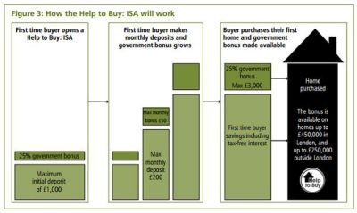
First up, a savings package for first-time house buyers. Almost like a waterfall graph, it deploys house imagery for how the finished job looks. Perhaps suggesting that ‘the roof is fixed’…;
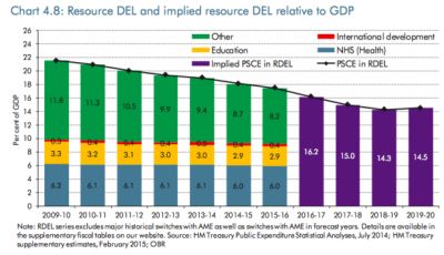
Next a duo found via right-wing commentator Fraser Nelson, who himself promotes six images to sum up this budget. He feels Putin will love the inevitable slash in Defence spending that he posits the drop off shown by the predicted purple bars means;
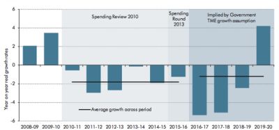
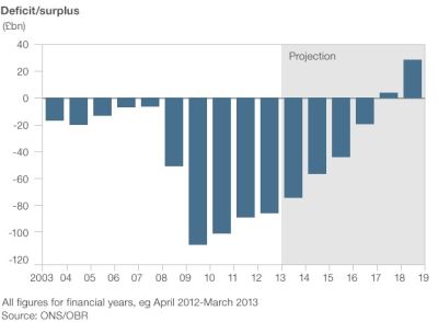
Then highlighting what’s since been termed the “rollercoaster” of public spending. A surplus by Year 4 of the next Parliament following deeper-than-current cuts, as shown by the tall final right-hand column, and note the cheeky horizontal trend-lines;
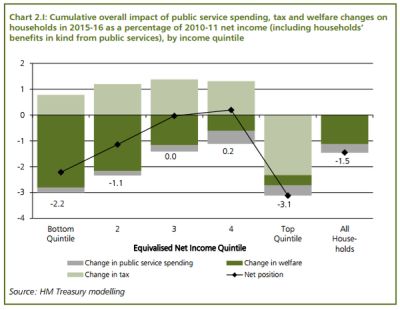
Excitement around a so-called “fourth quintile” follows, promoting that most will be no worse off;
Finally, they isolate when this surplus may arrive. This is the closest image to the HM Treasury slide they showed quickly, which itself was from these other official departments;
So it seems traditional bars are in.
There’s a couple of presentation pointers here for our own solution-selling slidedecks.
Showing plus-minus, above-below bars is a winner. They have a zero horizontal axis, but this could just as easily be any arbitrary number you need to highlight differences from.
And I do like the appearance of the trendlines. A seemingly innocuous little straight line that can be used to such dramatic effect.
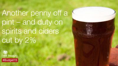
As a bonus from their twitter feed, you can’t help but marvel at how officialdom can embrace the photo-slide. Albeit with dodgy font and prose, along with a worrying use of stock imagery. Here’s just one example;
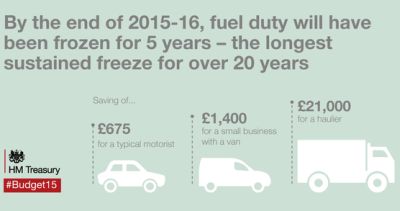
There’s also this slightly confused creation for new differences in fuel duty. Too many points in the text, and vehicle sizes with figures that possibly go unmatched;
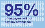
And to end with, their flickr page. They have a bash at infographics. Sadly showing that you need more than a few supposedly bespoke icons to make these sing. Here’s one cropped example that has the potential to work though, displaying the percentage of people that will pay no savings income tax as a result;