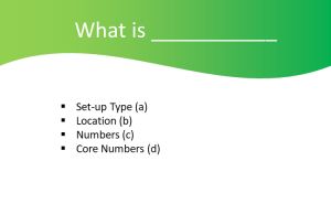
Your Situation Description Slide

I glimpsed a presentation the other day.
The image above is my replication of the starting slide. To denude its identity, I’ve rather summarised the text by describing each line’s content.
Regardless of setting, this kind of template is remarkably resilient. Commonplace across all manner of business rooms. And sadly selling displays are not immune.
A standard Microsoft-provided ‘theme’ helpfully provides space for your title. Then leaving the remaining two-thirds of screen estate for your glowing bullets.
For us solution salespeople there is absolutely no excuse for providing such fayre.
Yes, I know we don’t have enough time for playing around on our laptops, the days of having a slideware expert on immediate call are long past and we can’t be seen spending time doing anything that is not direct, accountable, customer-facing selling.
Yet trying to come up something that’s relatively quick to produce and will likely linger in the audience mind is possible.
Let’s dig into the above case.
I’m not going to rant about never acquiescing to a corporate or marketing diktat that each and every slide must have your logo, banner or any manner of expensively commissioned design idents. Nor shall I dwell on the irrelevance of slide titles. And as for bulleted text, well, why raise my pulse to undue stress levels.
There are all sorts of ways of reconfiguring this work to put across a message that sticks.
The one I’ll settle upon is to pull out the main “what”.
You’re describing a live, current situation.
It may well have many components. Here there appear to be a quartet.
Which one is the one?
The one you tune into most with your endeavours to fix.
If it’s either of the bottom pair of figures, then numbers lend themselves well to a vast array of (info)graphic representation. Perhaps even better if ‘core’ above is a subset. In which case, just pop up a diagrammatic of these.
Typing up a number, or creating something straightforward from the array of circular, wheel or concentric pie-like options could be your winner.
Then there’s the ‘location’ vibe. A map without labels, shorn of names, zoomed in or out. Or an actual photo. With a location pin handily placed upon it. You can adapt the standard packaged ‘teardrop’ shape easily. And I do applaud the current trend for replacing the hole inside the ‘pin’ with an alternative shape. Such as your logo silhouette, for instance.
Finally here, was that initial bullet. Involving ‘type’. A category. Possibly the most situation-dependent. Even so, a suitable evocative image ought not be too elusive should that prove to be your main hook.
And note, that it is rarely a mis-step to settle early onto that problematic pain which your audience may well be suffering.
In all scenarios, you can still talk about all four elements. But leave the lasting impression on that single part closely aligned to how you’ll be uniquely helping.
You might insist that two are vital. You cannot separate their importance. So go for two slides then. If you must. But you simply have to give them proper meaning. So make them memorable, not bullet-holed.
