5 Simple Slide Vibes For Your Next Deck From Google I/O Developers Conference Keynote 2018
The annual shindig for third-party appreneurs building googleware.
The full 100-minute keynote is youtubed if you feel strangely compelled, as well as a more bitesize 10-min highlights reel.
There are some high-end trickery showpiece parts. Animating all manner of VR-meets-AI wizardry.
Rather, I thought it useful to focus on the general themes. Particularly as these can readily be adopted and adapted by salespeople with presently a modicum of powerpoint prowess.
Let’s take first their format for title slides. Whether heralding a fresh section on a new product, feature or benefit, they’re all the similar stark display. Here’s one with the logo above the phrase, many others feature just the text.
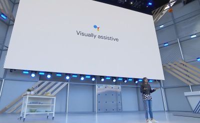
Complete with trendy trolley onstage too.
What strikes me about this treatment, is that I have seen many a salesperson agonise over these kinds of slides. Whether a section title, header or even brief two-or-three worder, there’s all sorts of conflicts. Do you use the mandated yet sadly often inappropriate corporate design? Try and find a cool photo on which to plaster your wisdom? Or requisition any other type of attention-grabbing imagery to sit alongside?
In this case, Google themselves are happy to let the words do the talking. So why can’t we? If an understated phrase in the corporate font and colour (and shorn of logo most times too) on a blank background can work for them, it could well work for us too. And save a whole bunch of lost thought-time trauma.
How do you tackle the awkward portrait mobile screen on landscape projection mismatch?
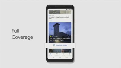
Always interesting to see how a specific feature is highlighted too.
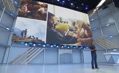
When it comes to portraying a point by photos, they were happy to use slideshows of several in a row for a few seconds. And also to have more than a single image on a slide. Here, the talker was pitching how they’re learning about a person’s phone use so that it may be scaled back through an “app timer”. Where their team is contacted by those “trying to find the right balance with technology”;
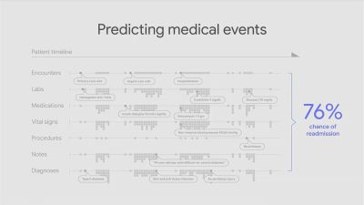
The chief exec wanted to suggest machine learning could predict medical events. Here’s a depiction of all sorts of tracked patient data, with their pay-off number in blue on the right;
Finally, let me comment on how the whole affair got started. A gentle gag. Referencing the infamous emoji debacle of the past year. Both Google’s burger and beer imagery was a captial-F fail. But not to worry, they got on to this major bug and restored the laws of physics, as well as restoring the cheese slice to its rightful place;
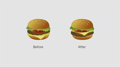

As you may know, I do indeed very much like this before/after treatment in a Sales presentation.
