Annual Report Pitch Design Compliance

Here’s a neat and friendly falling-short-of-sycophancy presentation trick.
A friend of mine was working with a huge telco.
The question of how to present to them cropped up.
Standard fare dictates a snoreshow laden with your livery adorning precious screen estate on every slide, alongside those oh so clever bullet markers derived from your logo, topped off with your focus-grouped corporate palette lathered across the lot.
How about showing you’ve given it some thought?
Any big corporate produces a glossy Annual Report. PDF downloadable at whim. They do like to enliven such with their own personality. Expensively crafted thematic designs for all manner of messages, graphs and highlighted wonder.
Why not ‘borrow’?
Here’s a trio of examples I took from the outfit concerned. Their 232 page document hid a wealth of design ideas you can happily piggyback to show them you really do care.
Each readily adapted with simple powerpoint skills. I’ve redacted much of their original text. You’d simply use the self-same for your key slides back to them. You needn’t have to make a long string of such, but at least (when explained to them what you appreciate) one or two would hopefully gain you vital brownie points.
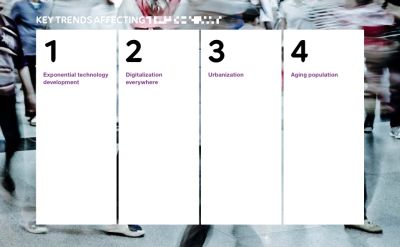
Up top is how they framed ‘four key trends’. Columns of black text (removed) descriptions on an action-blurred photo background.
Then here’s how they depict a text-laden point, here surrounding ‘43%’;

Followed with a graphical cycle of eight you could replicate;

If nothing else, at least you’ll be the only vendor they’ll remember for actually taking the time to read their published results.
