Another Way To Ditch The Tired Pie
You may well know I strive to find and use different ways to present. Data or Message. The work of the leading infographic ‘artists’ got me going. Especially David McCandles.
The tired old pie chart often shows up a page or slide as being stuck in the Eighties. Whilst if applied to a playlist that can only be a tremendous thing, when it comes to showing the vibrancy of your ideas, it is alas not.
By way of a review for a Netflix American female prison drama (Prisoner Cell Block H it apparently ain’t, proving perhaps not all 80s survives the test of time!) I came across the alarming size of the US incarcerated population.
It linked to a pdf highlighting figures from five/six years ago that 1 in 100 American adults are presently behind bars. Would you believe it, a staggering 1 in 37 have been locked up in total.
When Americans wonder why the rest of the world no longer aspires to be like them, as part of bar banter, an Englishman like myself need not rely on the baffling constitutional misinterpretation of the right to bear arms. Now we can also quote that in the USA they have 750 inmates per 100,000 people. Whereas say Scandinavia and Italy suffer only a tenth of that. (In England & Wales it’s supposedly 148, or a fifth).
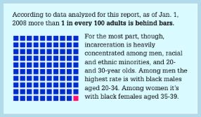
What I did enjoy about the pdf, was the presentation of one in a hundred.
What I liked was how stark the ‘one’ is. But also how simple it would be to apply across other data sets. I suspect that wherever you have a small a number of pie slices and with a big difference between them, this tactic will work well. In other words, if you have just two or three slices, where one dwarves the other two, this is a good new option.
And the bonus is, once you create the hundred squares, it’s relatively quick to edit for any new set of numbers on a new slide.

