Assessing Team Player Performance The F1 Raw Pace Way
In the Spring of 2019, Formula One motor racing showed the surprise of Mercedes domination over the expected yet unmaterialised Ferrari challenge. (Viewers switch off in droves.)
I saw this reported upon with the ten teams ranked after Round Five’s Barcelona Grand Prix by London’s Telegraph.
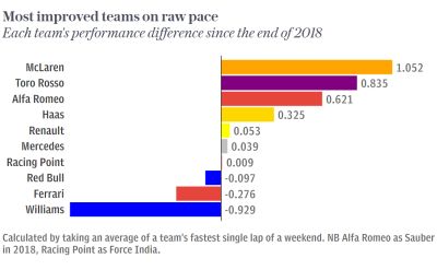
The above graphic charts that moment’s year-on-year difference in each team’s speed.
The traditional YoY comparison. Familiar to corporate meeting sufferers. Year-on-Year, period on period barcharts are a staple. Yet I’ve not often seen them presented like this. Normally, you get served up simply the plain pair of pillars side by side. But here, any differences are truly brought to the fore.
The implications for sales performance reporting are long. Revenue, margin, customers, volumes, averages.
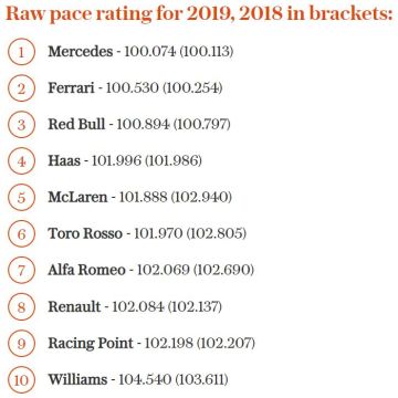
Then there’s a second charting. From a league ranking log.
In F1, they seemingly have a particular way of comparing speeds. Or raw pace, to give it their term.
They conjure a measure ‘over a theoretical 100-second lap in qualifying trim’. They calculate every one following on from the pace-setter. So in this present snapshot, back-markers Williams are adjudged to be coming home in 104.540s. Even farther behind than the previous year’s adjudication of 103.611.
Although I can’t quite fathom how the pace-setters are timed at 74 thousandths over 100 seconds dead. Still, here’s their log;
This requires you to benchmark each salesperson (or territory or sector) against a leader. I can imagine in certain circumstances this leading to a fraught exchange of views. Yet in the right situation, I sense it is a stylistic winner.
This may well translate onto prospect data too. Especially the this-year & last ‘difference-only’ highlight. Anything demonstrating a drop-off can no doubt aid your cause.