Can You Crunch Apple's Location Maps Graphics
Much tech media chatter as 2018 drew to its end about how – somehow – Microsoft have overtaken Apple as the world’s most valued company, perhaps led to the outfit ousted trumpeting their employee growth plans.
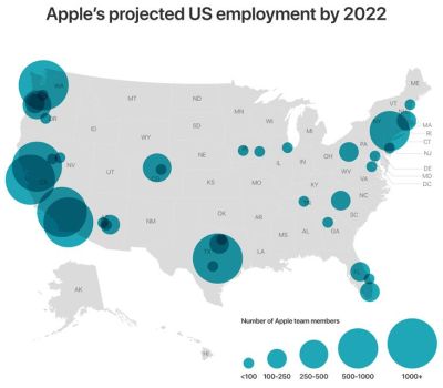
The geographic up top is one of three they officially released at the time of announcing a new billion-dollar campus in Texan city, Austin. Initially for five thousand, in time enough room for triple that.
Is it sub-standard charting?
When you reference this with the next they posted, you do think they’ve messed it up a little;
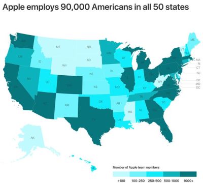
90,000 people employed. Yet both the biggest bubble and the density shading is only for a thousand staff and beyond.
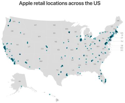
The confusion expands when you factor in the final imagery;
Maybe, that’s the idea.
To obscure a touch.
After all, with all the enormous, and undoubtedly quality, experience on which to draw, you wonder why these maps are so, well, underwhelming?
But why risk any design reputation with presentation open to critique as cluttered, cloudy, and possibly third-rate?
Even their choice of colour scheme, the blues, seems strange. The bubbles in particular are almost Powerpoint-shape default blue. As such an arch rival to Keynote I eye-roll at how this passed inspection.
Maybe they didn’t want to re-introduce any ‘peak-iphone’ debate, but their lead product’s latest range colours would’ve surely made for a more fertile platform.
You wonder what the given purpose for these graphics was. What brief might have said, ‘show locations with a few maps of the country, but don’t really say anything…’?
There’s a message for any year-kickoff maps you may well be planning as 2019 begins. What would you hope your actually say? And how will you sanity-check that they do?