Can You Picture The Winning Beeb Way To Enliven Barcharts?
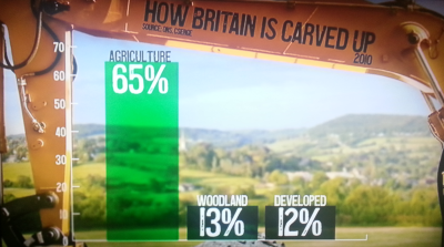
Tuesday’s Newsnight. Our Evan Davis assessed how Britain’s land was distributed.
I quickly snatched the above pic of their graphic.
I really did admire the idea.
I’ve long used photos as backdrops for slides, and this image frames the data beautifully.
The large farmland machinery and the meadow where it rests allow the histogram’s three bars to shine in the distant landscape’s space.
It’s a lovely example to follow and build upon in our solution selling slidedecks.
As a side point, I’ve always taken pics at prospect premises for slides. Almost by accident actually. My first sales team used one of those old Kodak carousel projectors with 35mm slides made up by a local freelance. So we often used pics of the factory or warehouse of the prospect to help personalise the presentation. What I learned perhaps most is that asking for permission – and you always must – to take such photos is an invaluable qualifier. You can gauge so much about the warmth or otherwise they genuinely feel towards you and your proposal. An instant yes accompanied with directions to help pose the shot means you’ve bonded and are sitting almost pretty. Any hesitation with excuses spouting protective company policy and your competition is in the lead…mind you, over a cheeky drink I should also tell you about the time I was ‘locked up’ by a way over-zealous Scottish security guard…
Anyway, back to the Beeb’s imagery. I think they chose a really good way to get their point across. Which doesn’t mean that other options don’t exist.
I spent an hour-and-a-half coming up with three alternate ways of showing the same figures by way of comparison.
The point is not that they are necessarily better (they’re not) but more that they offer a glimpse into different ways you might get similar numbers across where you haven’t the glorious pics on hand such as the BBC archives possess.
In all cases, I’m looking for images that are both memorable for your audience and which will distinguish you from your competitors.
First off, the modern classic billion dollar-gram treatment via the terrific David McCandless.

A piechart is way too obvious. Lazy, even. But a blockchart…? A sort of update to the tree map.
I’ve gone for a square to mark a full one hundred percent. This means an extra block appears for the missing ‘other’ 10% on the original graphic. I’ve used fairly standard colours, using the similar hues that originally evoked each category’s colours. Even though they’re hardly an exciting palette.
Next up how about icons? There are a few ways to reproduce this effect. To avoid using copyrighted material I chose a longer route. This included creating my own iconography. You may chose different methods for you own proprietary presentation.
![]()
Again, the size of the icon corresponds to each one’s appropriate share.
Finally, inspiration from the world of isotypes. Stacking mini-icons.
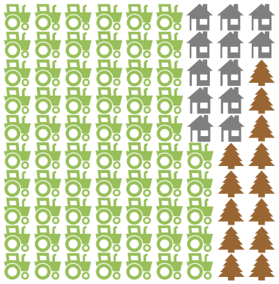
This was fairly straightforward, if a little fiddly. I shrank my earlier icons and placed upon a grid which represents the accumulated 90 percent.
There are a couple of other ways that occur to me too.
The square blockchart could use photos, rather than colours, as the fills. For instance, I’m sure with a bit of surfing I could have found creative commons ariel shots of the different land types from above that could easily fit into the required block.
Then there’s the isotypes. If I’d had more time, I might have used wireframe rather. Like line icons.
In any case, there’s plenty of idea food there. If time is short, then a cheeky billion-dollar-gram is a winner. If you’ve more prep open to you, then getting photos for yourself upfront is always a champion’s move.