Chart Graphics of 2024
My longlist for this post was fifty strong. Criteria for inclusion was not necessarily data I felt affinity to. More that the visual representation was something we could build on in our solution sell endeavours.
A chart can really make the winning difference on a bid.
A skill I'm all in favour of, as you can excel in from two of my books; 101 Charts That Sell & 101 Diagrams That Sell.
Here's some ideas for you to remix and make one that truly stands out.
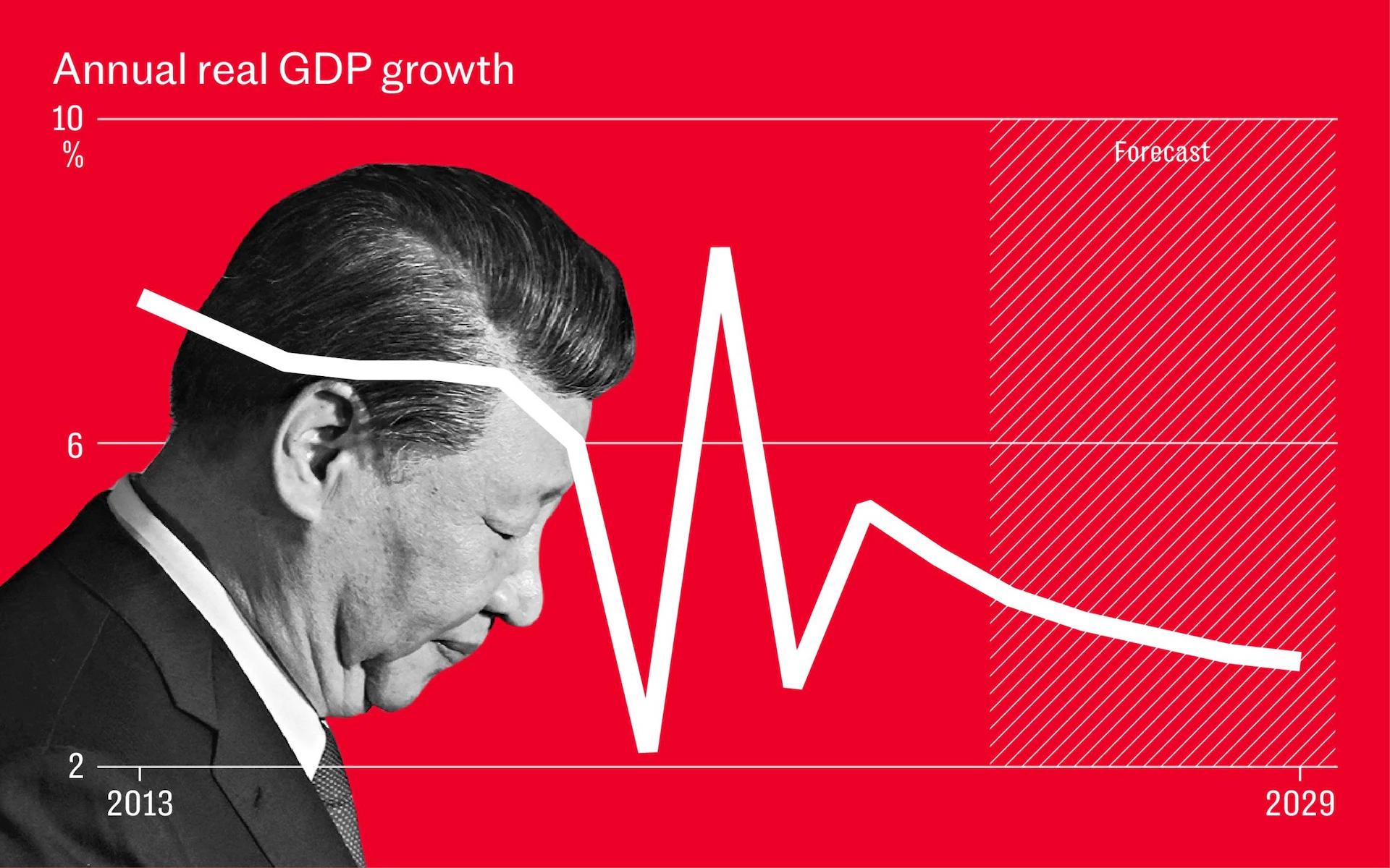
Let's start these fifteen-plus-bonus-one with London broadsheet The Telegraph. They like graphs on visual backdrops. This can be a striking device. Here, even better when denuded of data-ink. With only the falling GDP linegraph on the red with despondent failing Xi behind would be even better. Note too the forecast signifier.
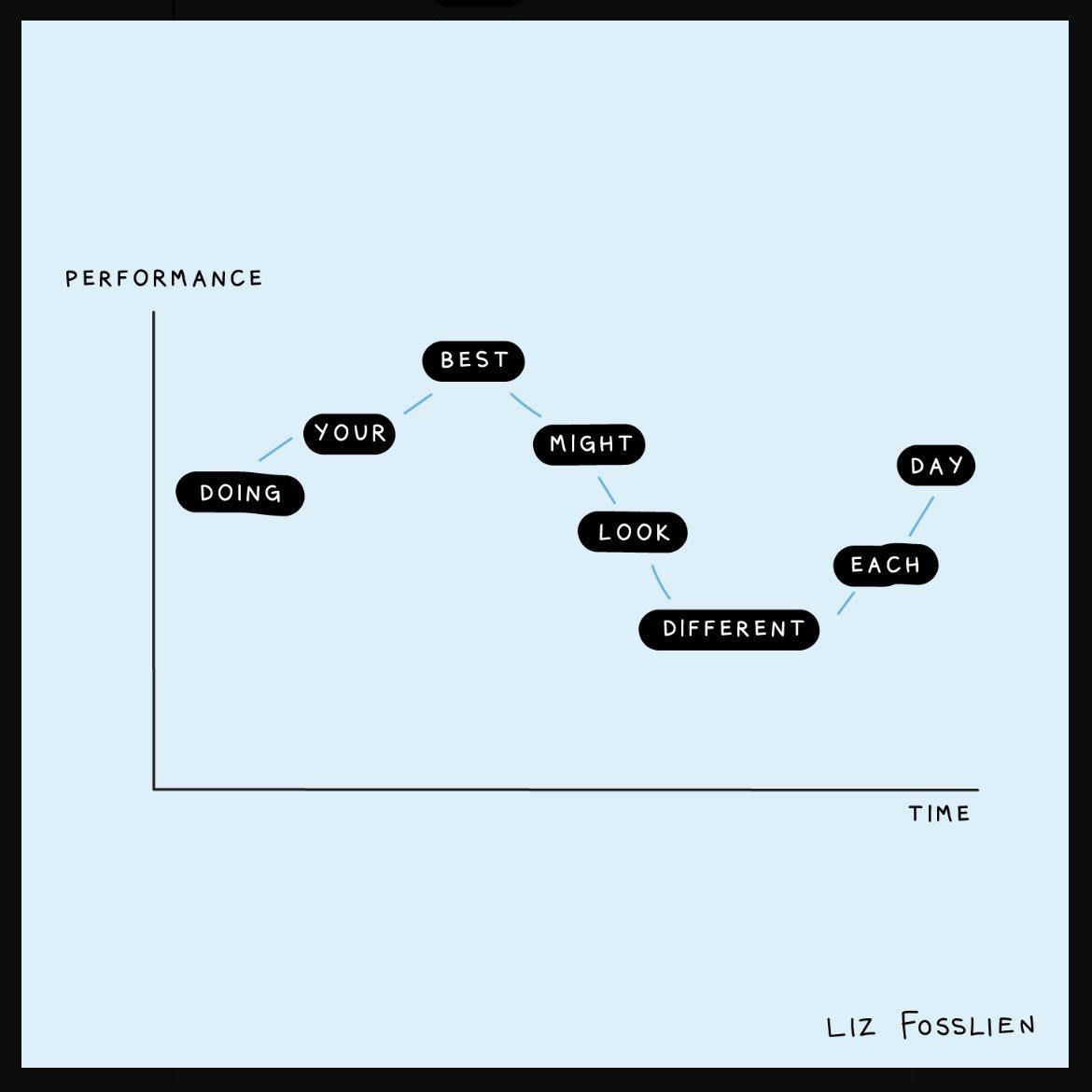
Here's another way of making the peaks and troughs of your graph come alive. With a message. The illustrator apparently first posted this is 2021, but I only found it recently.
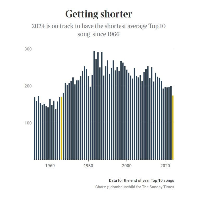
Opting for stark simplicity can also set your data message apart. Here's another Telegraph treatment.
Before leaving linegraphs, if you're yet to use a sparklines approach, you're missing a trick. Again, even better without all the 'chart junk' legends and scales.
And a neat dumbbell way of smoothing between two points, here four years apart.
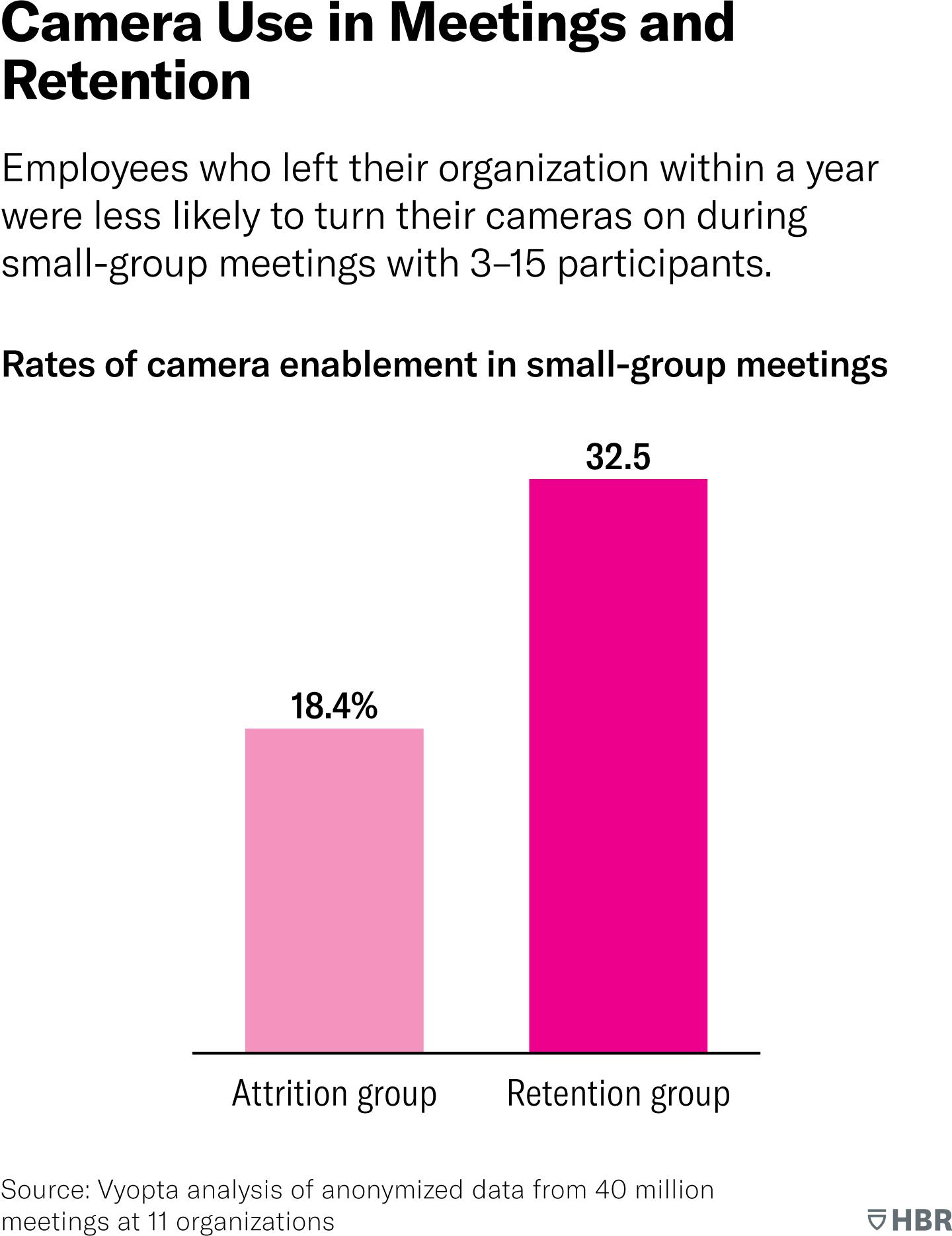
Moving on to barcharts. Consider the subtle power of unusual, non-standard colours. Nicely done by the HBR below, and not in their trad crimson.
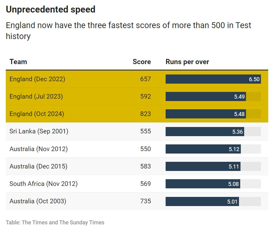
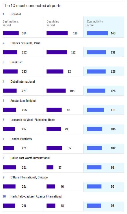
And older London broadsheet, The Times, highlight rankings well as with this Test cricket example.
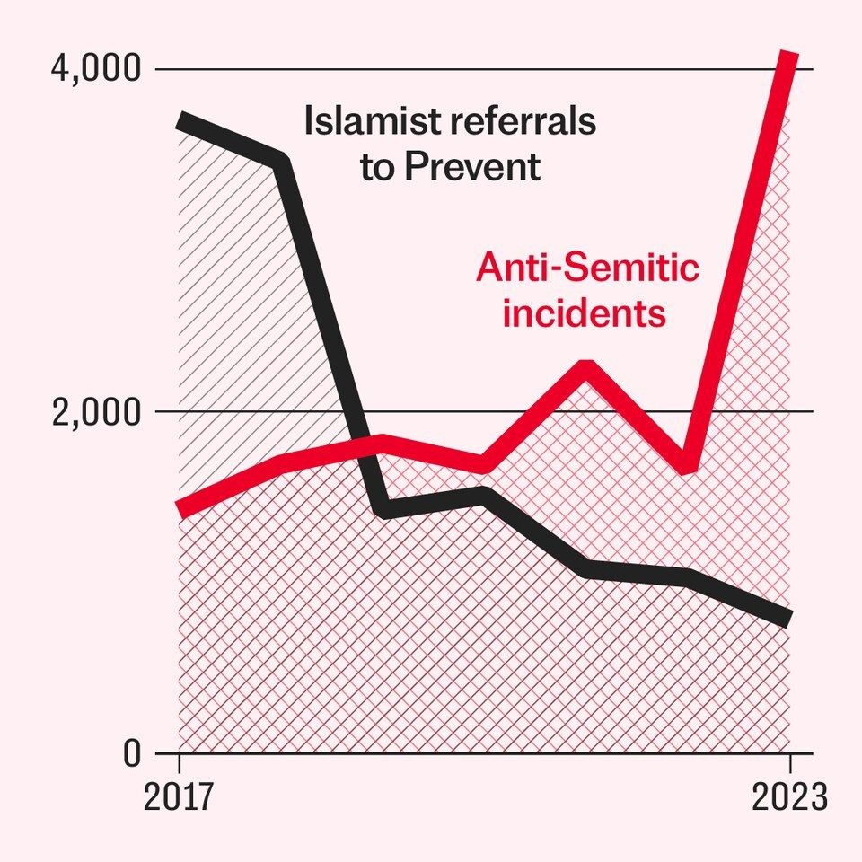
Comparisons between periods they also highlight well.
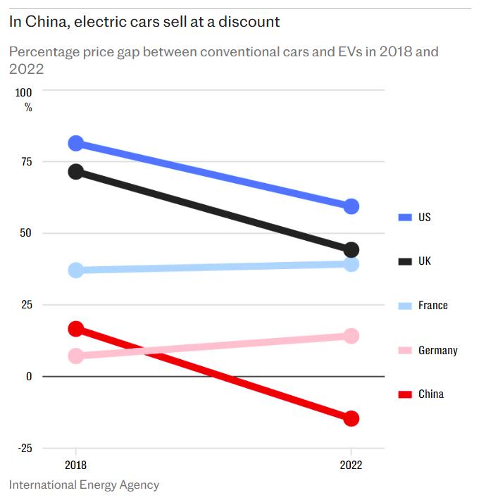
From the realms of impending power outages from years of grid mismanagement. Now being hypocritically made a whole lot worse to make even the ol' Third World weep, note how work-in-progress and future values are shown here.
Sticking with bars, here's a reminder we can separate out the clusters for a novel view.
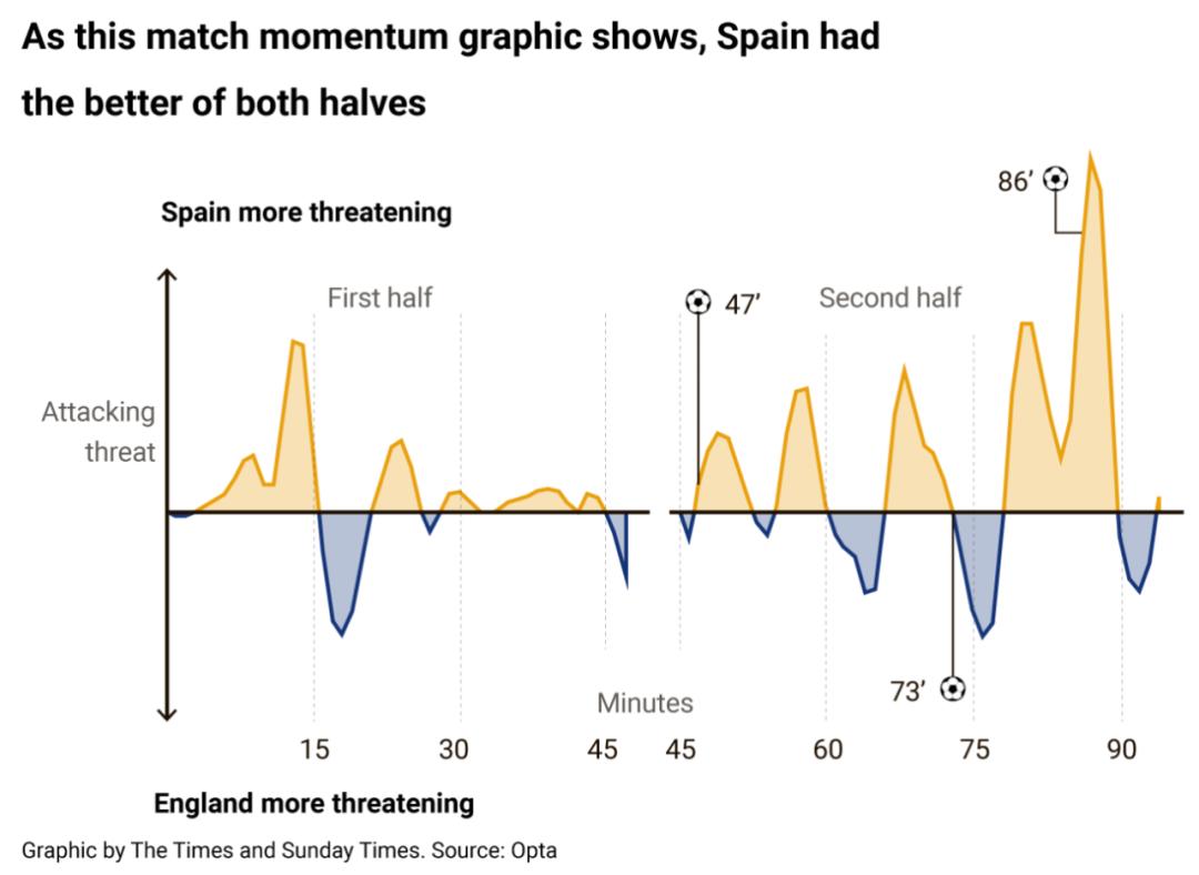
Next, a nod to the newly on the scene momentum graph. This one from the Euros final.
With another area chart leaning, this time from the 'beautiful' designers.
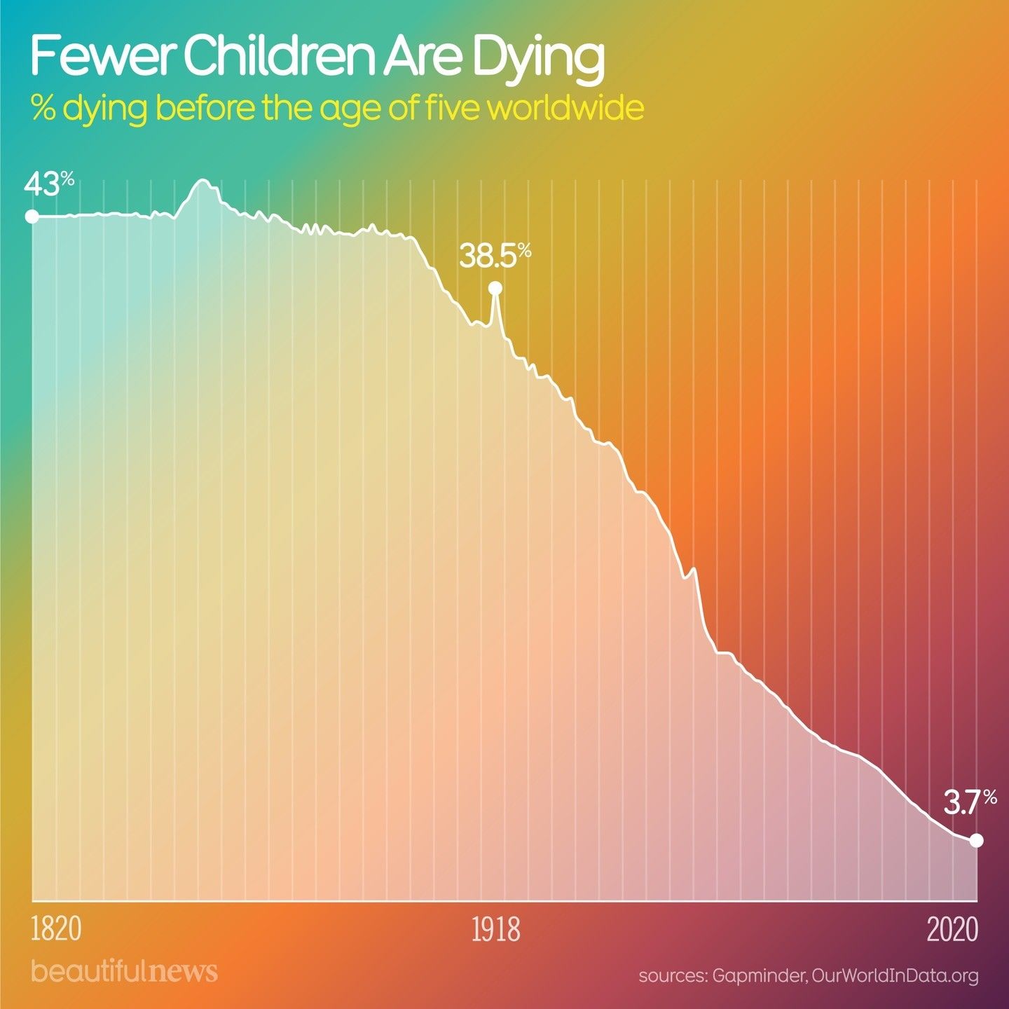
Looks like we're winning, people. Let's stay that way.
Which reminded me of this equally promising Before-After. Always a presentation masterstroke.
How about this bubble chart.
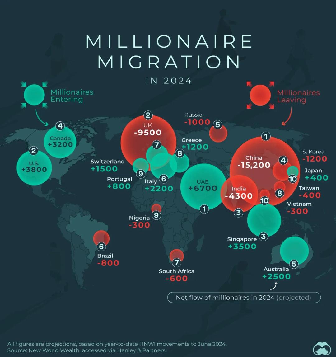
As well as this world map, also with data given a proportionate slant.
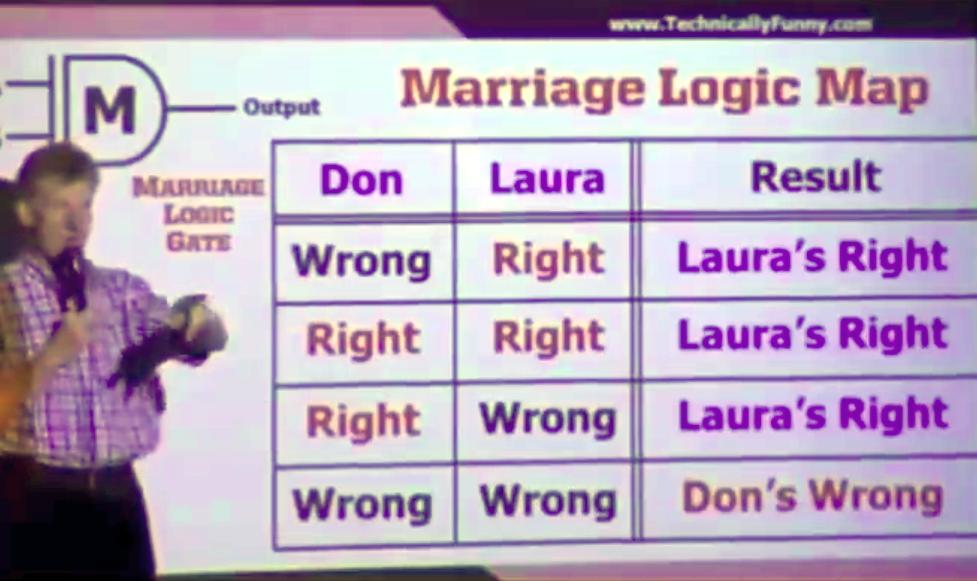
Finally, as charting guru Stephen Few would be pleased, you can always end on a table. Or in this case, a Logic Map...