Tweak The Team GB Backdrop If You Opt For Designer Slogans
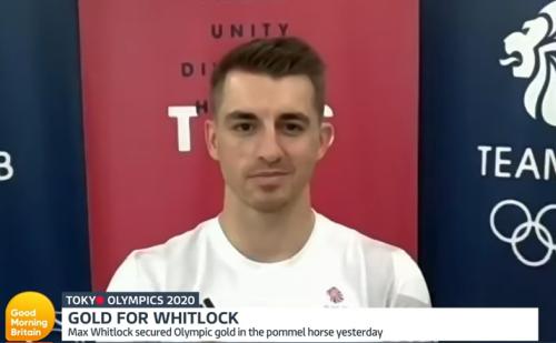
Max Whitlock. Gymnastic legend. Only the third man to defend their pommel horse Olympic crown. And after going first in the Final too. A brilliant routine which those favoured ahead of him could not then better.
This is one of his multiple media appearances in the aftermath of his superstar Team GB feat from Tokyo.
Enjoyable for his delightfully ornery two-year old daughter back home stealing the show.
Throughout these most trying of games for those involved, the British ‘messaging’ has stayed true to a standard format.
Behind the athlete, the lava red central sheeting, flanked by a pair of navy blue panels either side. The red with various slogans adorning them. The blue with team name and male lion with flowing mane and stuck out tongue headshot emblem.
Every now and then, the words in the middle pane change.
There’s always present it seems, in white sans serif capitals the (strange, to me anyway, with its lack of clarity manner) motto; THIS IS WHAT MAKES US. Each word with its own line.
Then scattered among, centrally justified too, all manner of other messages.
From the host city to variations on the initially touted ‘values’. As their website sets out;
the four values of Team GB are pride, unity, responsibility and respect, which sit under the over-arching principle of performance, which is the core focus of everything we do as a team and organisation.
Did anyone tell the designer of the panel behind Max here?
I was in a way reminded of the time, just around the Millennium, when the modern day staple of the custom-made backdrop arrived.
From athletes to university professors, they could only be broadcast if behind them was a detachable wall with either their branding or sponsor logos or both splattered over.
It’s become accepted behaviour.
There are plenty of examples from across commerce too these past eighteen months. Where the video platform virtual background became property of HQ’s Marketing or Corporate Comms department.
Yet in how so many of them fell down, Team GB also fall foul.
When there is a single presence on screen in front of it, they pretty much always obscure what’s behind.
Who is any the wiser as to what vital words stand behind Max?
When said marques are small, they make a pattern across the screen. Fair enough for media appearances.
Yet for a backdrop with impact in solution selling circles, if you do intend to make an impact in this way, then nothing really ought be hidden by the person – you – positioned in front and centre of it.
Why, I wonder did the media army behind this effort go for this design?
What would have been so wrong with using this set-up when a pair might be interviewed together, yet swapping it out for the solo performer?
Would a two-panel style – logo one side, ‘values’+ on the other – really be so radical?
With the golden ratio applied to the sizes of the panels [where the split in widths of them would be 62/38], I reckon it might have looked quite good. And certainly more memorable.
Can your treatment earn a Gold?