Graphic Designer Pizzazz
For those sales presenters boasting a touch more technical expertise, here’s a brace of ideas for enlivening your next message.
Choosing colours
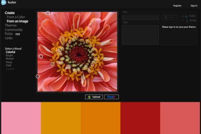
Colour scheme selection can be traumatic for the untrained. Even when we’re given a template from which to work, there are times when the standard white-and-whatever marketing diktat simply won’t do. Enter Kuler. It has a wonderful wow moment. You upload an image. It presents you five big blocks of the ideal colours to use from it.
All tonal, complementary and contrasting. It’s delicious. I am not a Powerpoint fan as you may know, but there are times when you do indeed need to construct the odd slide. The most memorable screens show big pictures, graphs and single words/slogans. Once you have worked out what you’re going to say, then how are you going to say it? Kuler’s gift is to tell you the best colours to use related to any pic you may have in mind.
Alternative graphs
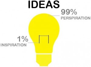
Been through all the options in your spreadsheet graphing wizard? I recently had hours of fun replicating what this chap created. It’s not for those in a rush, but the impact is sharp. Here’s one sparkle to sow the seed, featuring my adaptation of one example as a terrific alternative to a pie chart: