Happy 200th The Lady with The Lamp
Two hundred years ago today, a giant upon who’s shoulders we often gratefully perch was born.
Florence Nightingale was a true trailblazer. To get ‘acknowledged and revered as the pioneer of modern nursing’ would be an amazing achievement of its own. Yet to do so and as a by-product help drive the nascent profession of graphical charting from a side interest in statistics is also astonishing.
There are a handful of early chartings that usually get shown at the intro of a slideshow on data visualisation, for a ‘little bit of background’.
William Playfair’s first ever area charts from 1786. And his breakthrough pie chart (yes, it is all the fault of a Scotsman) of 1801. John Snow’s mapping of cholera incidence to pinpoint the offending water pump (a version still standing, outside a pub now bearing his name) in London’s Soho in 1854. Frenchman Charles Joseph Minard’s epic infographic of the Napoleonic army’s catastrophic losses during the brutal Winter of 1812-3 marching to Moscow and back, drawn up in 1869.
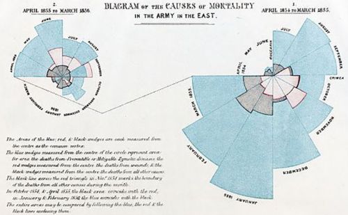
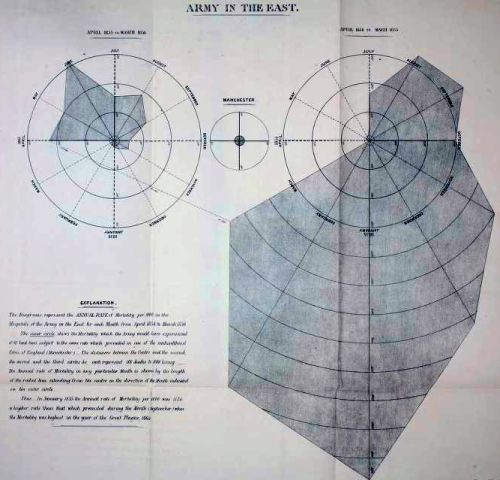
And Florence Nightingale’s chart innovation. Diagram of the Causes of Mortality in the Army in the East, pictured up top, from late 1858. For which she is today ‘known as the world’s first nursing informatician’. Nowadays termed a ‘polar area’, ‘rose’ and ‘coxcomb’ chart.
Her’s assesses the cause of casualties from earlier in that decade’s Crimean War. After inflicting humiliating defeat upon the Russians, she considered British Army fatalities needlessly high.
Interestingly, this was not her first attempt at graphing those ’causes of mortality’. Her initial 58-page report used what she termed a “bat’s wing” visual;
In part as thought a touch misleading, improved upon with what she apparently called “the Wedges”. And we can be thankful she did.
It prompted action of more resource committed to nursing care. As well as a strict Public Health Act being passed. Which for the first time in civilisation, eventually stretched average life expectancy beyond 40 years.
Her diagram shook the powers that be with its stark display. Whilst 4,500 died in battle or directly of wounds, a whopping 17,500 died from disease. Preventable disease at that.
For this analysis, she seemed to work with and from the platform of William Farr. Intriguing as the charting built upon his work from six years earlier:
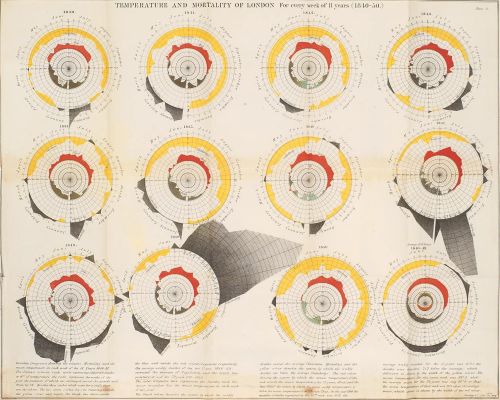
Although Farr came up with the idea first, he is not widely associated with its marvel.
The reason? He drew incorrect findings from his data.
Seeking, like his contemporary John Snow, to determine the cause of London cholera outbreak, he concluded that it was a general miasma. When it was in fact, the water-borne culprit.
This is a telling tale.
One we presenting solution sellers ought well bear in mind when charting.
If history is written by the victors, then Florence was a just winner. Make sure you join her.