Inspire Section Title Slides Like Media Talkshop
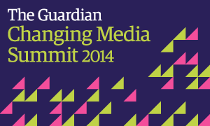
This image caught my eye. It’s an ad pumped through a particular sidebar of a site I was recently viewing. You won’t be surprised to learn the event it promotes has its own blog and hashtag; #GdnCMS.
I instantly took to it.
I also liked the banner design from the actual website I clicked through to. I’ve slightly edited it with a few seconds of keystrokes to fit here neater;
I don’t normally worry too much about slides that signal a pause in a presentation. When you have finished one section and are about to move on to the next. You don’t want the audience to get ahead of themselves, nor reveal any magic too early.
I tend to use a standard slide filled with a single (corporate) colour, and a brief title, just a word or two writ large, even semi-large. (I sometimes use the photo with title approach also).
It struck me that this was a cracking little theme to build on for these sometimes tricky to conjure slides.
Particularly useful if there’s more than one company colour, created once you can easily batch-change colours at will and deploy across several sections.
If it works for those media luvvies – people paid to make things stand out this way – then I’m sure it can work for us in solution selling pitches and help give us that extra little bit of distinction we crave.


