Name That Data Set
Much liking this new addition to slide composition.
I’ve often put up slides with words blanked out for the audience to guess. Same with numbers. Even filling in missing log positions (rankings) on a table.
I’ve also sought to create a kind of logo from a particular chart shorn of its digits and text.
Yet I’ve never asked the assembled throng what a chart is when denuded of its labels.
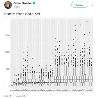
So hats off to Oliver Roeder. Currently working as a data journalist of The Left. He sounds worryingly obsessed with some American tv game show that you sense he really ought not be wasting his time with. An element of the general knowledge quiz leads him to tweet a chart going back yonks on outcomes. Who cares?
But as for his technique, what a winner.
name that data set
I wonder whether this would work best if the chart is not your typical line plot. Something unusual, a format different from what those looking on are used to seeing. As is the case here.
In fact, many a chart slide may well benefit from this treatment. Without the question posed.
Let the picture sink in. Then, once explained, add in labelling. Even leaving out much of it if you like. Simply altering colour for or highlighting your key measure.