Oscaring Your List Slide
Last night’s curtain fell on the latest annual movie gong season with the Oscars.
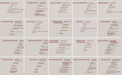
Above is a google image results screenshot of various nomination slides as announced by The Academy back on 13 Jan.
A simple grey background, with an etched feint branding – including key word along the bottom from side to side – and a dark red main font colour (blacker secondary one) of simple sans serif font.
Note the ‘forward-slash’ style justification of the text alignment of the actual list lines. Starting to the right of a top-left title.
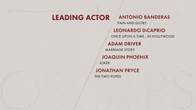
Here’s surname-alphabeticised ‘leading actor’ in close-up;
I often see salespeople scratching their heads whilst spending way too much time working on a similar slide for where they want a small list typed up.
Hopefully, this treatment from Hollywood provides comfort you don’t need to overthink it.
Whilst the exact branding style (the word OSCARS and the light-touch lines) might prove tricky to try and copy, it is unnecessary.
What’s also pleasingly minimal, is how they announced the winners on the big night. Here’s how the ground-breaking first subtitled victory was displayed;

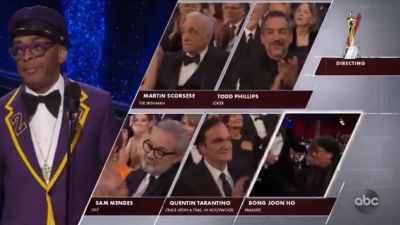
And as an aside, compare this to the tv coverage, which used the same template as the nominations slide. Here’s the live best director screenshot;
Readily adaptable for our slidedecks.
At least now you’ve another format you can take confidence from.
A few words from a winner… #Oscars pic.twitter.com/SAecq7aiYF
— The Academy (@TheAcademy) February 10, 2020