Project Plan Charts
How do you explain a project plan? All those separate activities at all sorts of different times, some of which can happen concurrently, others only once a previous one is complete. You could list them. In almost bullet form text. I hope you don’t do this too often.
(Although it is acceptable if you’re detailing discrete items and the starts of on-going tasks, especially as part of a Proposal page depicting a deal timeline.)
Anyway, whether you know the intricacies of critical path analysis, gantt charts or pert analysis or not, you probably recognise this following type of treatment. (I scanned this from a business plan I was party to a couple of years ago).
Now it is good to graph these kinds of things. And when it comes to Props, they tend to be an essential component of a winning bid. But what about off the page?
I recently crafted a Proposal which already included an outline, first-guess style project plan in this vein. With further discussion, the activities could be honed. This required the consideration of a new iteration.
The problem I had was that neither the lengths nor the sequence of the now eight activities were yet obvious. So I needed to draw them in a way that would help lead to their final definition.
So rather than re-do the original chart, I chose to apply a touch of infographic thinking and elected instead to create a standalone slide. It could then be used as a reference during the upcoming chat.
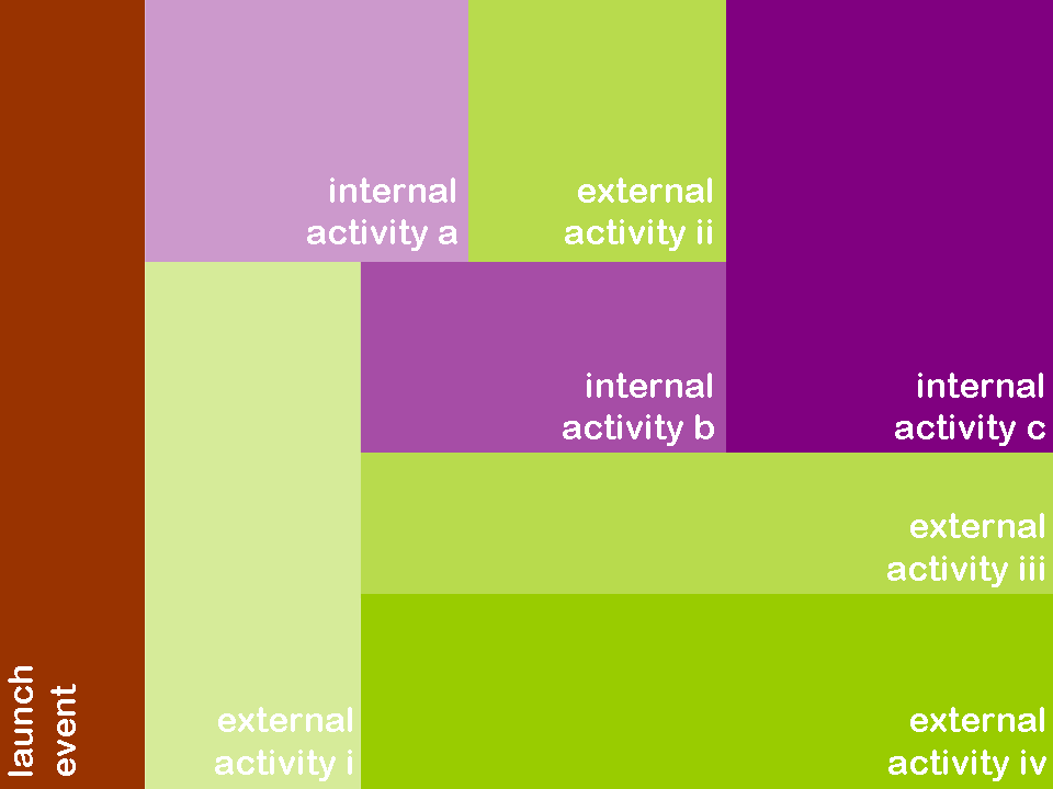
Here’s an adaptation of the single image I produced.
The size of each block was roughly representative of the time it’d need. It’s like a graph without the axes showing, so the start is with the kick-off element set out on the left-hand edge with time moving right-wards. The colours indicate the two main categories of activity.
And I’m pleased to report it did indeed help generate discussion. We managed to agree on what was required and move on. A useful 3-D visual for any planning presentation slide or specific call briefing reference material.


