Record Net Income Charting Shows Profits Of A Little Extra Graphic Effort
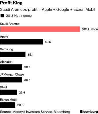
Bloomberg are normally on point with their graphics. This week, the world’s greatest ever profits were revealed by the despotically-run Saudi state oil firm, Aramco. As you can see above, a sideways barchart the reporter’s mode of choice.
A standard treatment. Taking a mere minute or two to produce. We’ve all seen such on a sales slide.
Then we note the Financial Times frontpage. The story was their splash on the next morning’s London print edition. Here’s the image created;
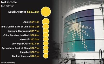
As you can tell, a little extra effort designwise.
They take a standard (stock, almost) photo of an Aramco refinery storage tank and place on it their display of graphing.
Which makes the longer impression on you?
Yet the FT’s isn’t perfect. Bubbles are always tricky to use. The eye struggles to determine relative size. A double-area’d circle not immediately obvious as such.
Also, the ‘y-axis’ scale is not applied. The bubbles are placed in a column according to rank. Regardless of amount as a scatter plot would have it. Still, for ease of presentation, this is understandable.
It does show though, how you too can make your numbers that crucial bit more memorable.