Shine In Sales Ops With Footie Heat Maps
Relax, this isn’t an old school Activity = Sales blog.
This may be a post more for the self-labelled sales ops geek, yet its central idea is widely applicable.
I’ve been fairly pleased to see the analysis of football matches develop these past couple of seasons.
Following on from cricket’s explosion in this regard post-hawkeye ball tracking, all manner of player-touch-maps, heat-maps
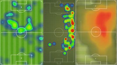
These indicate where an individual player spends his game time. You also get crackers that look at entire match action areas. The more ferocious the hue, the greater the time in that part of the pitch.
They have a sibling. The “touch map”.
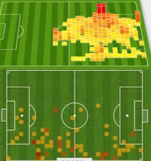
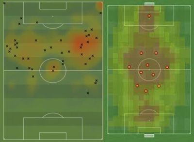
You get all kinds of combos of the above. Here’s a touch and heat map for a player, then a team heat map with average player positions throughout the game.
And then there’s another treatment. Here, a touch map for a single player. The pitch handily cut up into roughly 3-yard squares. There seems to be yellow for one touch, amber, orange and red for four perhaps?
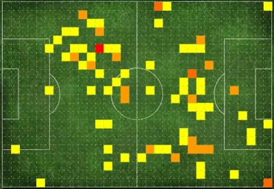
If a coloured block can signify a touch, I wonder whether they could do outlines or hashing for a tackle or a shot?
Obviously for our likely limited powerpoint window or skills, blocks we can do.
I then surfed for other graphical examples of block-orientated heat maps.

Despite excluding the scales from this trio, you can still see that whenever you’ve got more than two variables your eye is easily drawn to the action areas.
It did strike me that if you had the time (and that’s a pretty big ‘if’ unless you’re in a sanctioned Sales Operations capacity) you’d be bound to unearth killer insight from plotting in this way.
The mechanics are fairly straightforward. You’re constructing something similar to the scatter plot graph that we learn aged around 9. But grouping together similar values, rather than piling your crosses all on the same mark, and making them a darker colour block.
The variables you can look into include meeting type, funnel components, main contacts and their frequency of touch, sectors time on, deal make-ups, deal length, client lifetime, up- or re-sell frequency or profitability.
As with anything like this, it should never be pretty picture for pretty’s sake.
What to do with it? The obvious point is that you can share best-practice. What is the top performer doing that everyone can do more of? Which combinations yield greatest returns? Where can salespeople focus an effort for maximum immediate impact?
Trends and winning facts will emerge. They must be spread across the team.
If you’re looking at this for your own performance, you could even map the deals you most want to replicate. How did they run? What must be carried over to every other bid?
When you do uncover a gem (even if merely to confirm a team-wide hunch) this visual will be dynamite. It won’t be forgotten and you will shine in its undoubted glow.
One for the sales-geeks perhaps, but building on, copying even, proven best-practice is possibly the only shortcut we can ever take. And that still takes diligent prep.